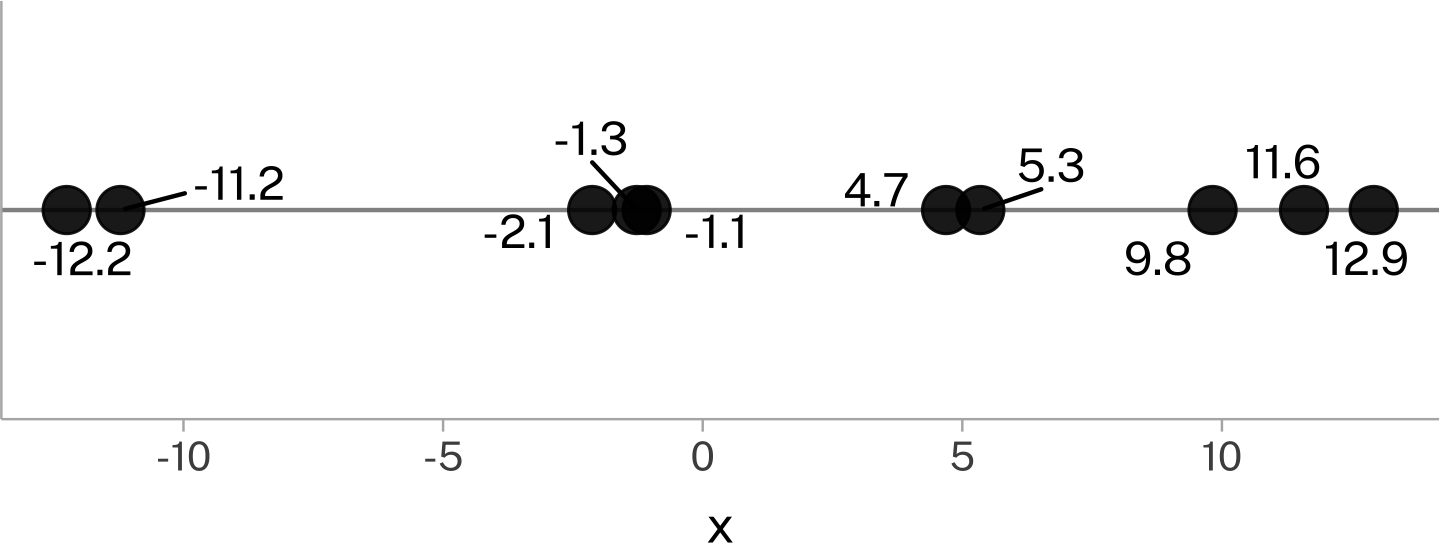
Let’s say I gave you these values on a number line:
And I say to you
Guess
Guess the next value that’s going to appear in this data series. The person with the smallest absolute difference between their guess and the actual next value wins.
What’s your strategy?
All models are wrong
There are a bunch of principled and unprincipled strategies you could take. Two are:
The next number is probably going to be like one of the numbers that have already appeared, so I’ll pick one of them randomly.
The next number probably won’t be too far away from the mean of the numbers that have appeared so far, so I’ll calculate it and use that.
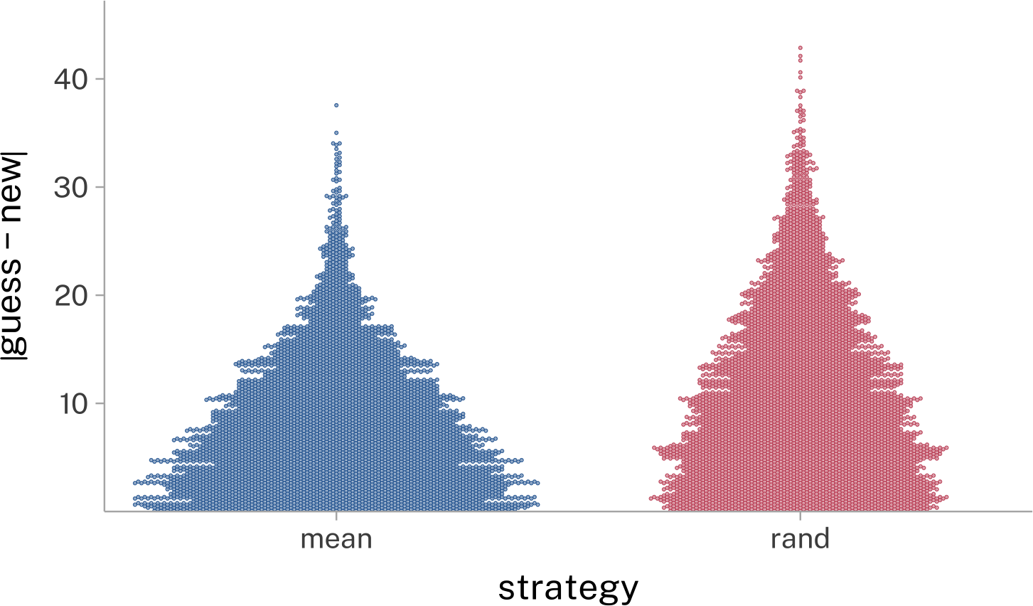
We can see how well these two will do for just one case
The next new value was nothing like either new guess. But if we play this out over 5,000 simulations, it looks like guessing that the next value will be the mean does better than choosing a random value from the original data series.
The mean ≠ “typical” ≠ “possible”
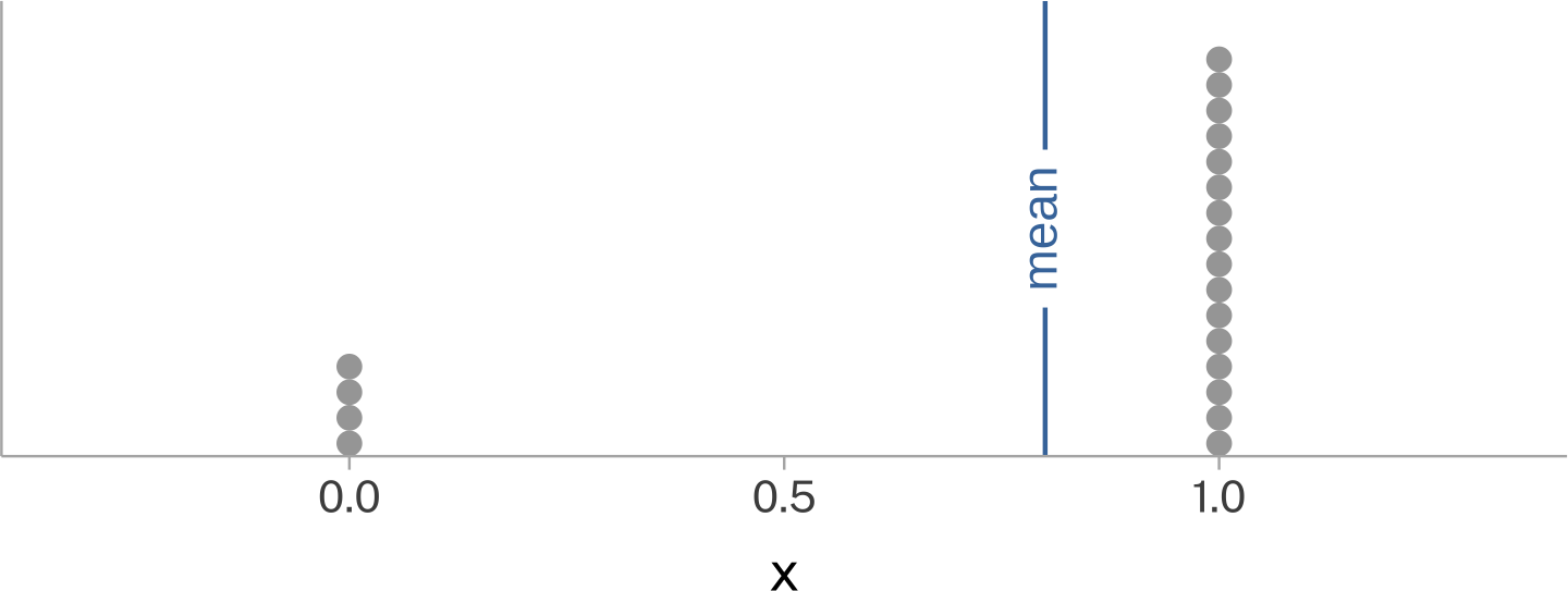
There are many cases where the mean of a data set will never be typical of the individual data points, but it would still wind up being a good value to guess what the next data point will be. For example, any extremely bimodal, or binary data.
Binary data sample:
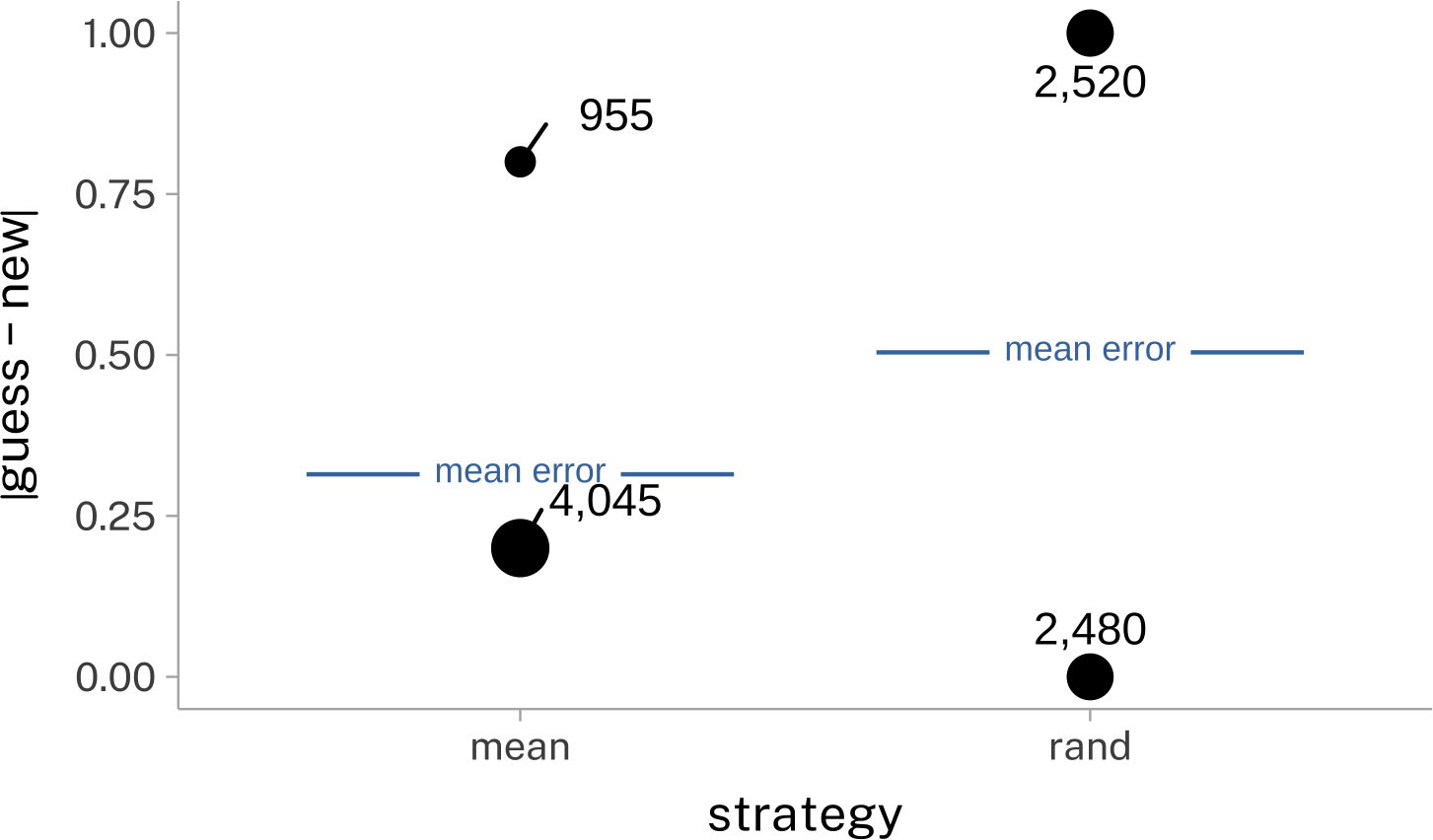
Guessing the next value using either the mean, or a random [0,1] 5,000 times:
This is why quantitative descriptions of the “average consumer” or “average voter” might wind up not characterizing many or any actual people.
Mean and Standard Deviation
name
R function
population symbol
sample symbol
mean
mean()
\(\mu\)
\(\bar{y}\)
standard deviation
sd()
\(\sigma\)
\(s\)
variance
var()
\(\sigma^2\)
\(s^2\)
Mean
A mathematical definition of the mean is:
\[
\bar{x} = \frac{1}{n}\sum_{i=1}^n x_i
\]
The two pieces of the mathematical formula can get translated into R functions like this:
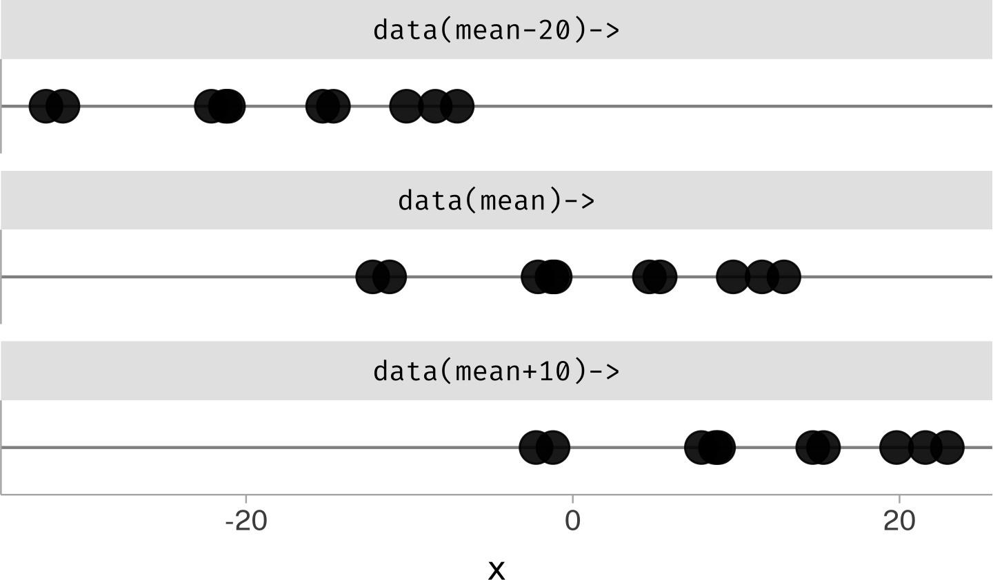
If you add a a constant value to all numbers in a data series, the mean of the data series will also shift by the same amount.
mean(rand$x)
[1] 1.641674
mean(rand$x +10)
[1] 11.64167
mean(rand$x -20)
[1] -18.35833
Sometimes we’ll flip this reasoning and think about how adding a value to the mean can shift the location of the data.
For this reason, the mean is sometimes called a “location parameter.”
Standard Deviation
The standard deviation is a parameter describing how “spread out” a data set is. You could think of some others. For example: how big the difference is between the largest and smallest value.
max(rand$x) -min(rand$x)
[1] 25.1723
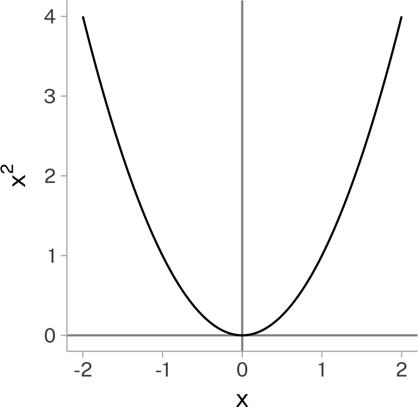
But, that’s putting the pressure of describing the whole dataset on just two of its values. Ideally every data point would contribute in some way.
Building up to standard deviation
Let’s build up to the full mathematical definition of the standard deviation.
“Spread out-ed-ness”
First, we need some way to define, for each data point, how spread out it is with respect to the entire data series. The standard deviation uses each data point’s distance from the mean for this:
\[
x_i -\bar{x}
\]
The mean describes some kind of central location in a data series.
So, each data point’s distance from the central point describes its “spread-out-ed-ness”.
Total spread-out-ed-ness
If we tried getting either the total or average spread-out-ed-ness from just \(x_i-\bar{x}\), we’ll run into a problem:
sum( rand$x -mean(rand$x)) |>round(digits =2)
[1] 0
Because the mean describes a central point in a data series, when we get the distance of each data point from the mean, there’s going to be just as much data below the mean as above it.
If we stop here, we actually have the definition for the sample variance.
x <- rand$xx_bar <-mean(rand$x)total_diff <-sum((x-x_bar)^2)(x_var <- total_diff / (length(x)-1))
[1] 78.25034
var(x)
[1] 78.25034
Getting back to the original scale
To get back to describing the spread-out-ed-ness on a scale similar to the original data, we’ll take the square root (undoing the squaring we did before) to get the sample standard deviation.
\[
s = \sqrt{s^2}
\]
sqrt(x_var)
[1] 8.845922
sd(rand$x)
[1] 8.845922
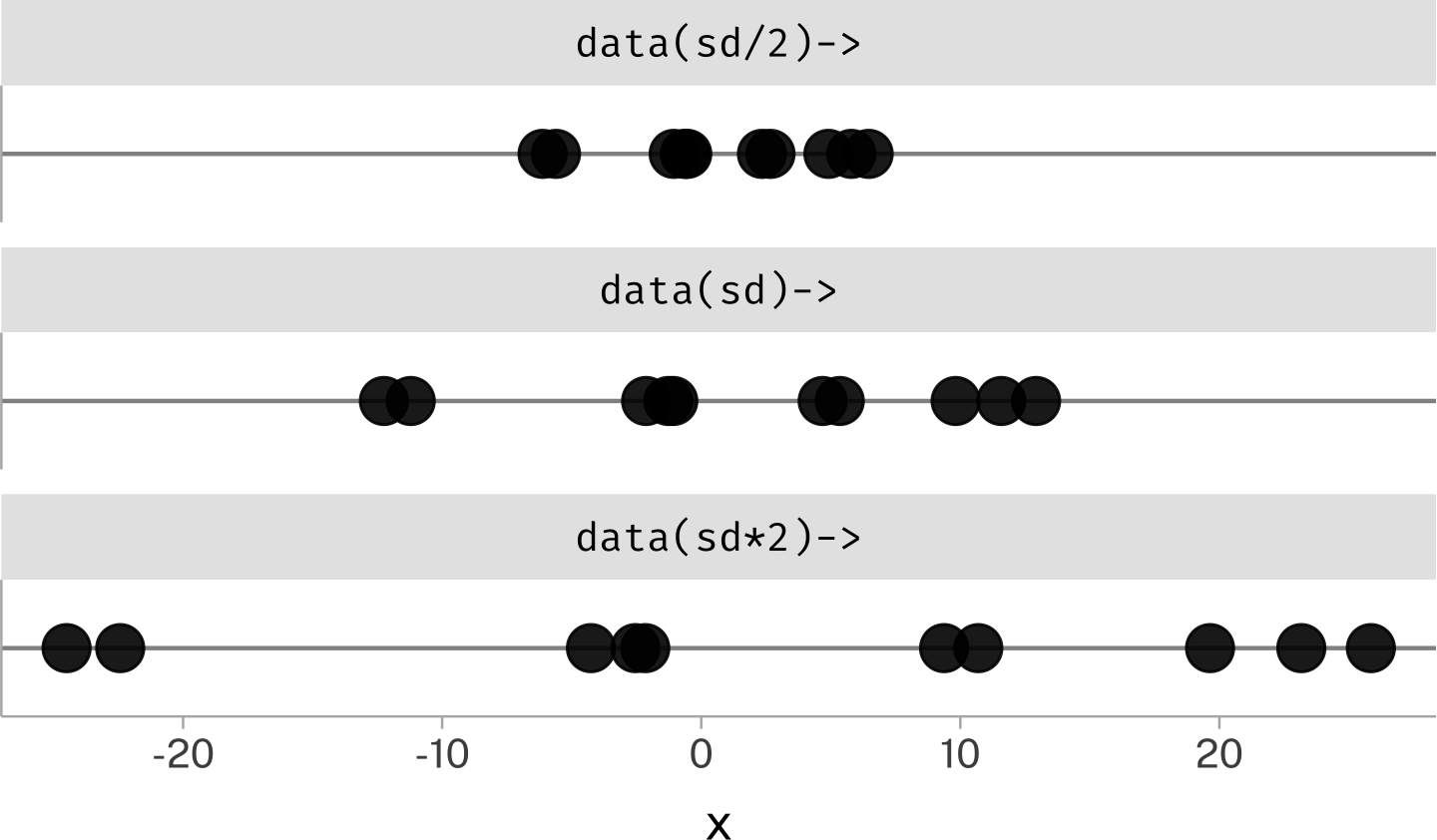
“Scale Parameter”
If we multiply or divide every data point by a constant value, the standard deviation winds up being scaled to the same degree.
sd(rand$x)
[1] 8.845922
sd(rand$x *10)
[1] 88.45922
sd(rand$x /10)
[1] 0.8845922
Just like with the mean, we’ll sometimes flip this reasoning around and think about multiplying or dividing the standard deviation as adjusting the scale of the data.
For this reason, the standard deviation is sometimes called a “scale parameter”.
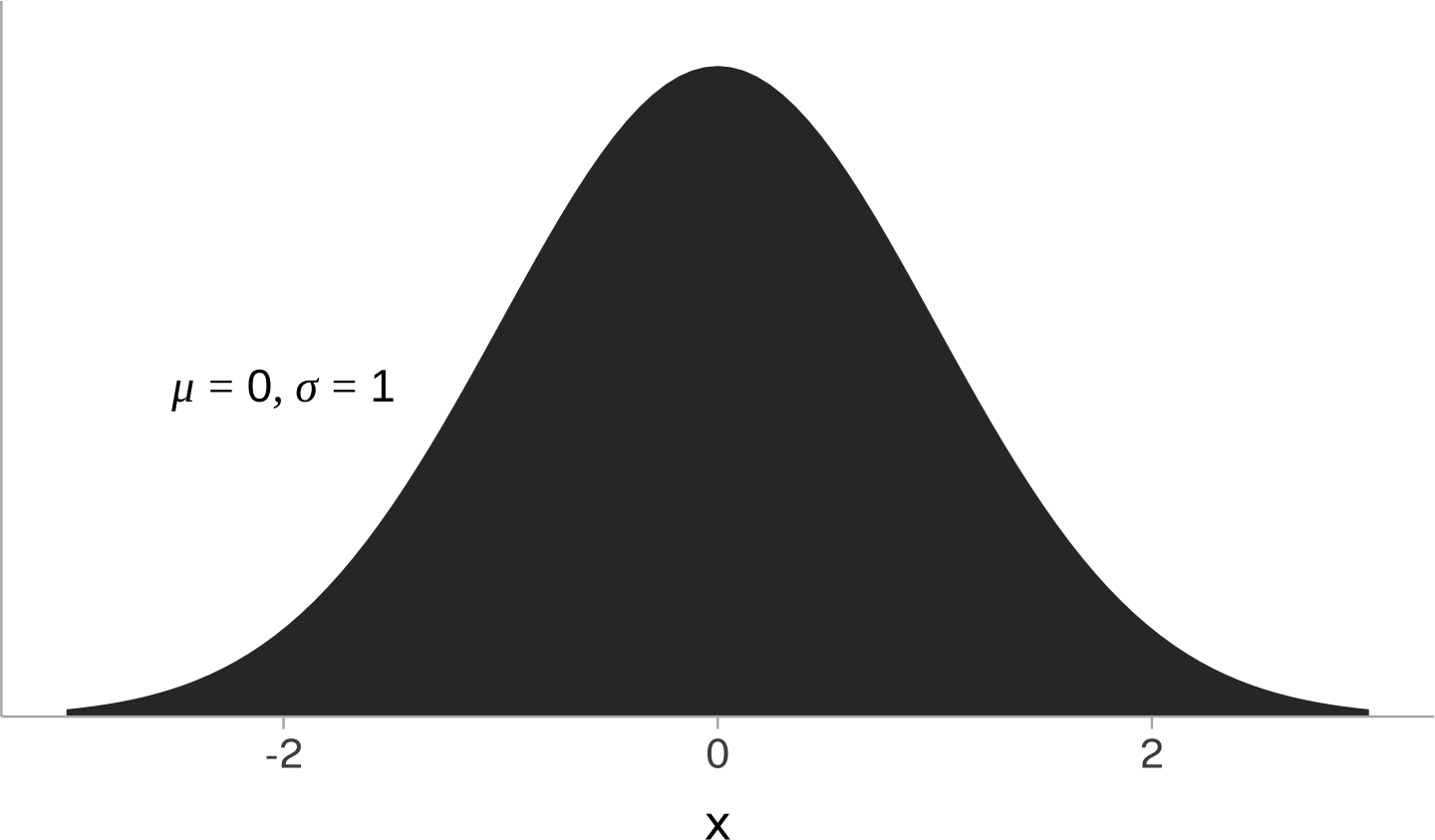
The Normal Distribution, Again
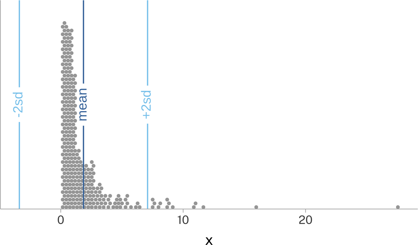
We can use the mean and standard deviation as just summary statistics that can be calculated for any data set. Depending on the data set, they may or may not be all that good for characterizing the typical range of values.
But, the special cases \(\mu\) and \(\sigma\) can be used to also mathematically define the normal distribution’s probability density function.
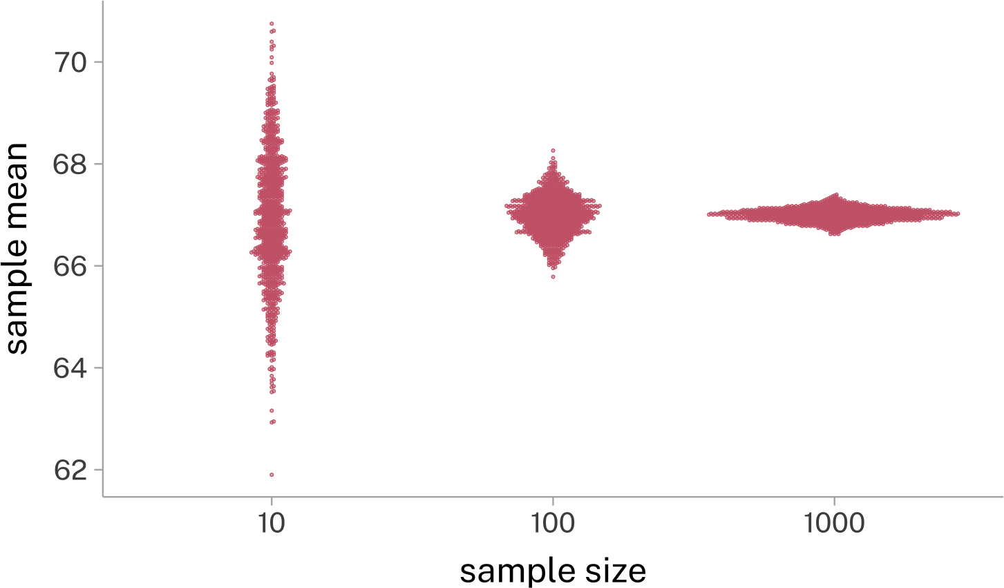
As \(n \rightarrow\infty\), the contribution of each individual \(x_i\) to the sum decreases.
In small sample sizes, occasionally large samples to one side are less likely to be counterbalanced by occasionally large samples to the other side.
In smaller samples, each individual value has a larger influence on the mean estimate than in larger samples. We can look at this with the “Leave One Out” method, where we calculate
The mean of the sample
The mean of the sample with one value randomly left out
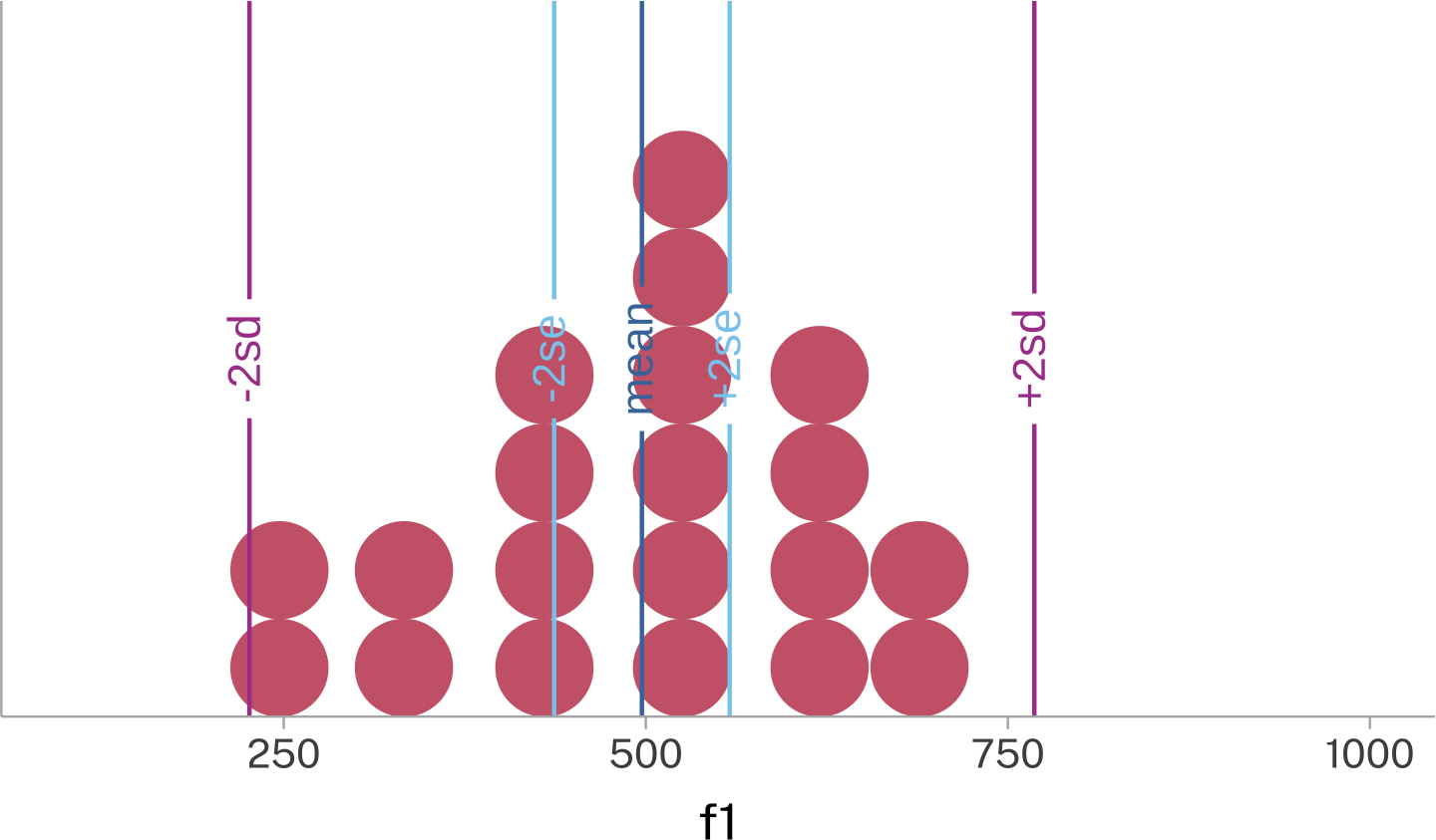
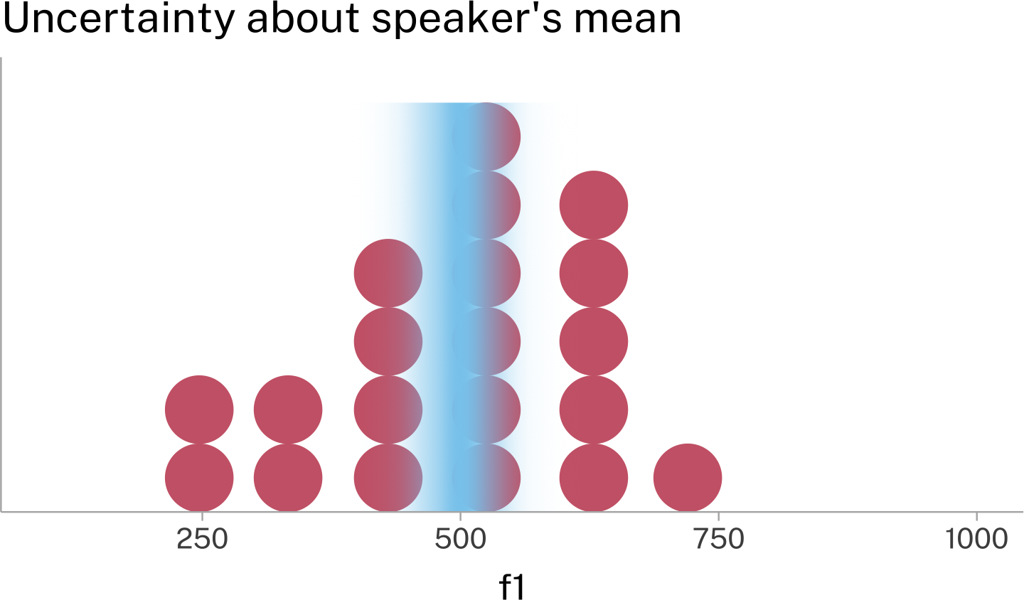
One good way to get a sense of how the Standard Deviation and the Standard Error relate to the mean is to overlay the range of mean±2sd and mean±2se on the plot.
The ±2sd range marks out where we expect the vast majority of the data to appear.
The ±2se range marks out where we expect estimates of the mean to appear.
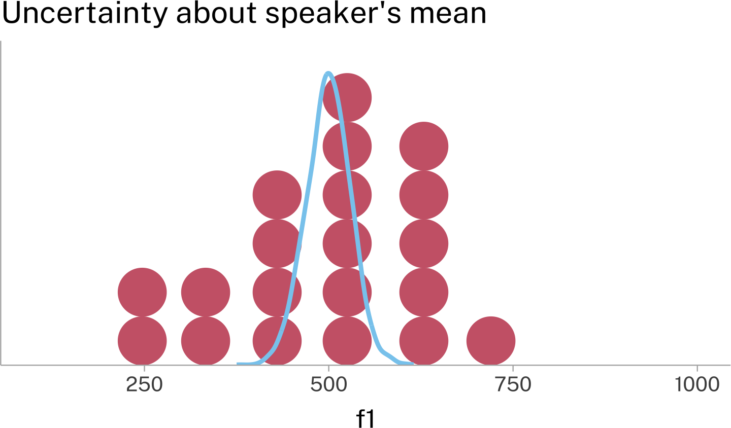
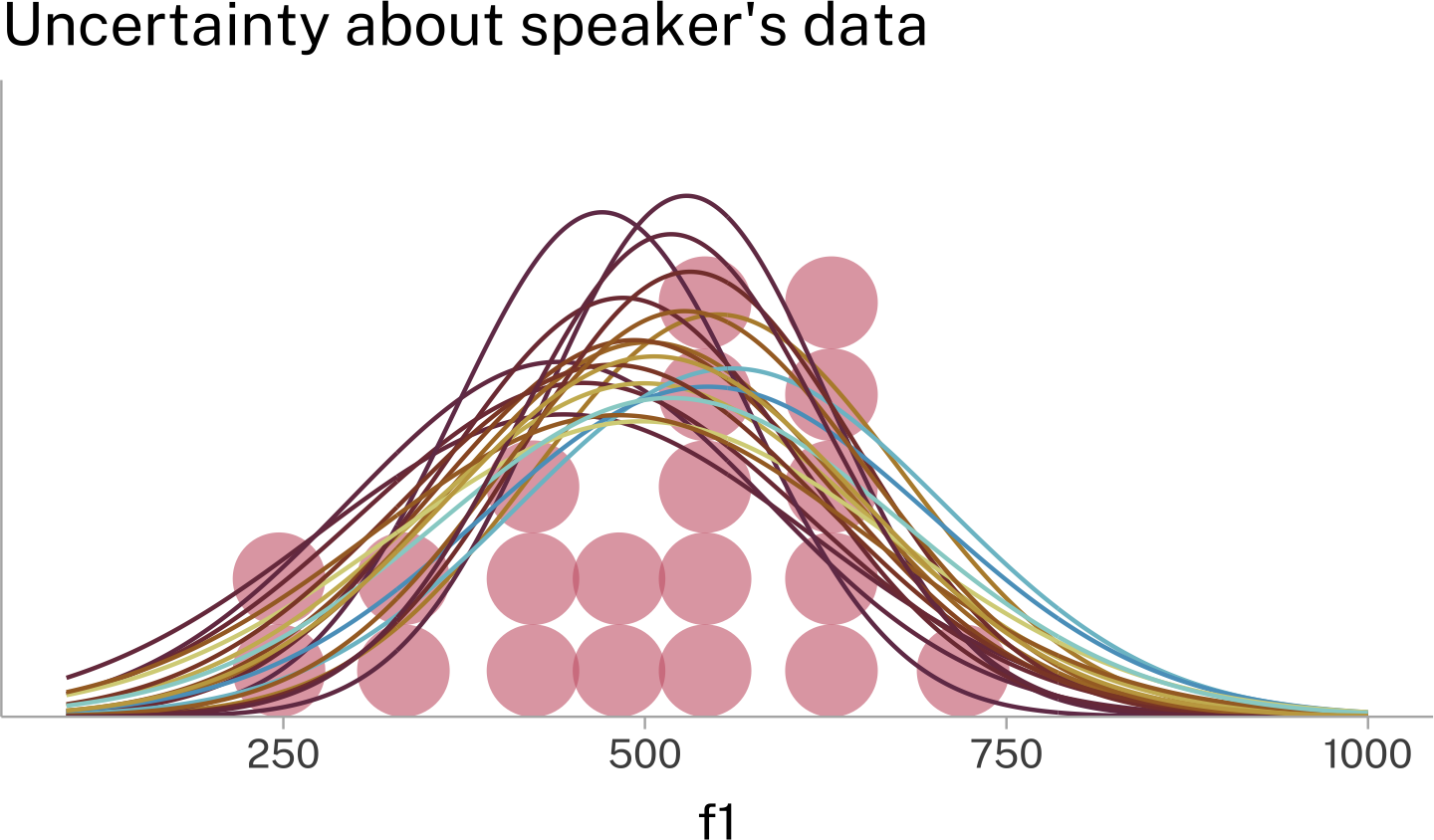
While ±2se is useful for seeing the lower and upper bounds of the Standard Error distribution, we can also plot the full probability density function on top of the speaker’s data. Here are two different ways of visually presenting that information.
One way to think about this is that even though we have 1 mean and standard deviation estimate for the data from this speaker, there are a variety of normal distributions, some more probable than others, from which our data could have been sampled.
Sampling and sampling
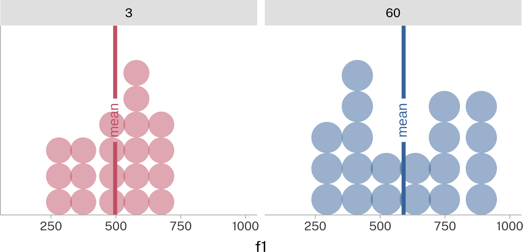
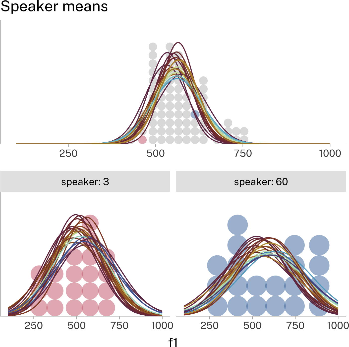
Another thing to think about is how we’ve looked at one speaker’s data drawn from a larger data set of many speakers. Each individual speaker’s data could be summarized by taking the mean of their data, like in this example of speakers 3 and 60.
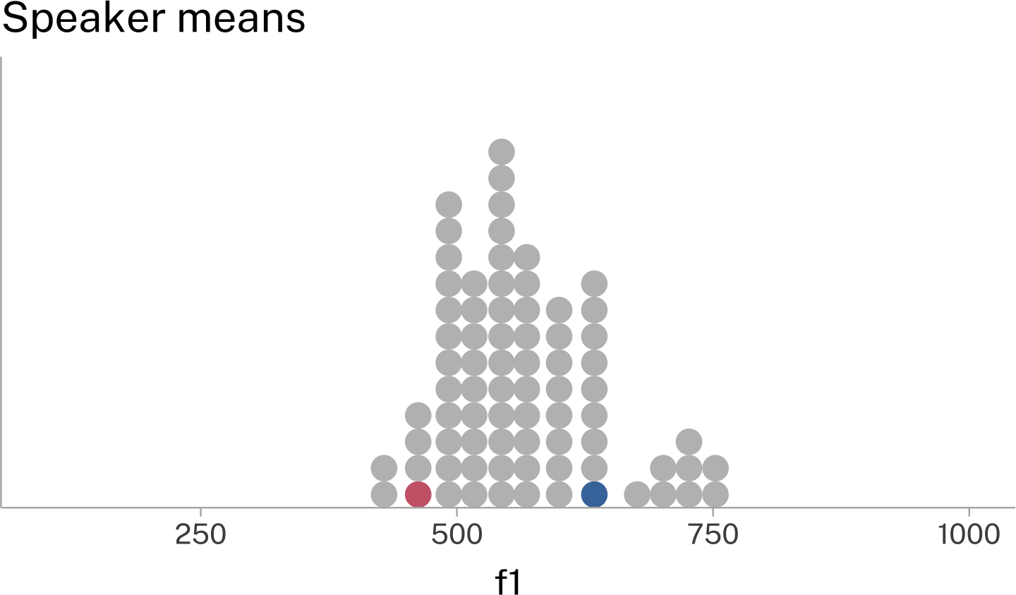
If we summarize all of the speakers’ data this way, and plot these means, we’ll see another distribution form.
We can think of this as a distribution over speakers, from which individual speaker means are drawn.
Cascading uncertainties
Remember that for each individual speaker, we have some uncertainty about their actual \(\mu\). That uncertainty should cascade upwards a little bit to uncertainty about the distribution over speakers.
But at the same time, if we think speakers’ means are drawn from an overarching distribution, that should help reduce our uncertainties about any one speaker’s \(\mu\), because it should be a plausible value drawn from the population.
Being able to fit models that capture the trading back and forth of uncertainties in nested data is one of the main goals of this course.
Bringing it all together into one big picture:
We have a variety of distributions from which individual speakers’ \(\mu\) are drawn.
In turn, we also have a variety of distributions from which individual speakers’ data was drawn.
Reuse
CC-BY 4.0
Citation
BibTeX citation:
@online{fruehwald2024,
  author = {Fruehwald, Josef},
  title = {What Is a Mean?},
  date = {2024-09-25},
  url = {https://lin611-2024.github.io/notes/meetings/2024-09-25_mean-sd.html},
  langid = {en}
}
---title: What is a mean?draft: falsedate: 2024-09-25format: html: code-tools: truecode-annotations: selectcode-link: falsetwitter-card: truecategories: - mean - standard deviationknitr: opts_chunk: fig.align: center echo: false message: false warning: false dev: [light_png, dark_png] fig.ext: [.light.png, .dark.png]include-after-body: text: | <script type="application/javascript" src="../../assets/darklight.js"></script> ---```{r}source(here::here("_defaults.R"))``````{r}library(tidyverse)library(ggdist)library(ggrepel)library(geomtextpath)library(patchwork)library(gt)library(marquee)```# Mean as a model```{r}#| echo: true#| code-fold: true#| code-summary: Random values setupset.seed(2024)tibble(x =rnorm(10) *10) -> rand```Let's say I gave you these values on a number line:```{r}#| fig-width: 5#| fig-height: 2rand |>ggplot(aes(x, y =0), )+geom_hline(yintercept =0,alpha =0.5 )+geom_point(size =5, alpha =0.9)+theme_no_y() -> rand_prand_p +geom_text_repel(aes(label =round(x, digits =1)),box.padding =0.5,family ="Public Sans" )```And I say to you::: callout-tip## GuessGuess the next value that's going to appear in this data series. The person with the smallest absolute difference between their guess and the actual next value wins.:::What's your strategy?## All models are wrongThere are a *bunch* of principled and unprincipled strategies you could take. Two are:- The next number is probably going to be *like* one of the numbers that have already appeared, so I'll pick one of them randomly.- The next number probably won't be too far away from the mean of the numbers that have appeared so far, so I'll calculate it and use that.We can see how well these two will do for just one case```{r}#| echo: truetibble(rand_guess =sample(rand$x, 1),mean_guess =mean(rand$x),next_x =rnorm(1)*10,rand_diff =abs(rand_guess-next_x),mean_diff =abs(mean_guess-next_x)) |>round(digits =2)```The next new value was nothing like either new guess. But if we play this out over 5,000 simulations, it looks like guessing that the next value will be the mean does better than choosing a random value from the original data series.```{r}#| fig-width: 5#| fig-height: 3rand |>reframe(rand =sample(x, size =5000, replace = T),mean =mean(x),new_x =rnorm(5000)*10 ) |>pivot_longer( rand:mean,names_to ="strategy" ) |>mutate(abs_diff =abs(value - new_x) ) |>ggplot(aes( strategy, abs_diff,fill = strategy,color = strategy ) )+stat_dots(side ="both",layout ="hex" )+scale_y_continuous(expand =expansion(c(0,0.1)) )+scale_x_discrete(expand =expansion(0) )+labs(y =expression(abs(guess-new)) )+guides(color ="none",fill ="none" )```::: callout-important## The mean ≠ "typical" ≠ "possible"There are many cases where the mean of a data set will *never* be typical of the individual data points, but it would still wind up being a good value to *guess* what the next data point will be. For example, any extremely bimodal, or binary data.Binary data sample:```{r}sampler <- \(n){sample(c(0, 1), size = n, prob =c(0.2, 0.8),replace = T )}tibble(x =sampler(20)) -> rand_binary``````{r}#| fig-width: 5#| fig-height: 2mean_binary <-mean(rand_binary$x)rand_binary |>ggplot(aes(x = x, y =0) )+geom_dots()+geom_textvline(data =tibble(x = mean_binary ),aes(xintercept = x ),label ="mean",color = ptol_blue )+scale_y_continuous(expand =expansion(0) )+scale_x_continuous(expand =expansion(0.4) )+theme_no_y()```Guessing the next value using either the mean, or a random \[0,1\] 5,000 times:```{r}#| fig-width: 5#| fig-height: 3rand_binary |>reframe(rand =sample(c(0,1), size =5000, replace = T),mean =mean(x),new_x =sampler(5000) ) |>pivot_longer( rand:mean,names_to ="strategy" ) |>mutate(abs_diff =abs(value - new_x) ) ->binary_guess_simbinary_guess_sim |>summarise(.by = strategy,abs_diff =mean(abs_diff) )-> binary_mean_errorbinary_guess_sim|>count( strategy, abs_diff ) |>mutate(n_lab =format(n, big.mark =",") ) |>ggplot(aes( strategy, abs_diff ) )+geom_point(aes(size = n) )+geom_text_repel(aes(label = n_lab ),box.padding =0.5 )+geom_textsegment(data = binary_mean_error,aes(xend =after_stat(x+0.75),yend = abs_diff ),label ="mean error",size =3,color = ptol_blue,position =position_nudge(x =-(0.75/2) ) )+scale_size_area(guide ="none" )+labs(y =expression(abs(guess-new)) )```This is why quantitative descriptions of the "average consumer" or "average voter" might wind up not characterizing many or any *actual* people.:::# Mean and Standard Deviation| name | R function | population symbol | sample symbol ||--------------------|------------|-------------------|---------------|| mean | `mean()` | $\mu$ | $\bar{y}$ || standard deviation | `sd()` | $\sigma$ | $s$ || variance | `var()` | $\sigma^2$ | $s^2$ |## MeanA mathematical definition of the mean is:$$\bar{x} = \frac{1}{n}\sum_{i=1}^n x_i$$The two pieces of the mathematical formula can get translated into R functions like this:$\sum_{i=1}^nx_i$: `sum(x)`$\frac{1}{n}$: `1/length(x)`or``` rx_bar =sum(x)/length(x)``````{r}#| echo: truerand |>summarise(total =sum(x),n =n(),mean1 = total/n,mean2 =mean(x) ) |>round(digits =2)```### "Location Parameter"If you add a a constant value to all numbers in a data series, the mean of the data series will also shift by the same amount.```{r}#| echo: truemean(rand$x)mean(rand$x +10)mean(rand$x -20)```Sometimes we'll flip this reasoning and think about how adding a value to the *mean* can shift the location of the *data*.```{r}#| fig-width: 5#| fig-height: 3adds <-c(0, 10, -20)map( adds,~rand |>mutate(add = .x,x = x + .x,label =case_when( add >0~str_glue("data(mean+{add})->"), add <0~str_glue("data(mean{add})->"),.default ="data(mean)->" ) )) |>list_rbind() |>ggplot(aes(x = x,y =0 ) )+geom_hline(yintercept =0,alpha =0.5 )+geom_point(size =5, alpha =0.9)+theme_no_y()+facet_wrap(~label,ncol =1 ) +theme(strip.text =element_text(family ="Fira Code") )```For this reason, the mean is sometimes called a "location parameter."## Standard DeviationThe standard deviation is a parameter describing how "spread out" a data set is. You could think of some others. For example: how big the difference is between the largest and smallest value.```{r}#| echo: truemax(rand$x) -min(rand$x)```But, that's putting the pressure of describing the whole dataset on just two of its values. Ideally *every* data point would contribute in some way.### Building up to standard deviationLet's build up to the full mathematical definition of the standard deviation.#### "Spread out-ed-ness"First, we need some way to define, for each data point, how spread out it is with respect to the entire data series. The standard deviation uses each data point's distance from the mean for this:$$x_i -\bar{x}$$- The mean describes some kind of central location in a data series.- So, each data point's distance from the central point describes its "spread-out-ed-ness".#### Total spread-out-ed-nessIf we tried getting either the total or average spread-out-ed-ness from just $x_i-\bar{x}$, we'll run into a problem:```{r}#| echo: truesum( rand$x -mean(rand$x)) |>round(digits =2)```Because the mean describes a central point in a data series, when we get the distance of each data point from the mean, there's going to be just as much data *below* the mean as *above* it.```{r}#| echo: truerand |>mutate(diff = x -mean(x),sign =sign(diff) ) |>summarise(.by = sign,total_diff =sum(diff) ) -> pos_neg_diff``````{r}pos_neg_diff |>mutate(sign =case_match( sign,-1~"-",1~"+" ) ) |>gt() |>fmt_number(columns = total_diff,decimals =1 ) |>my_gt_theme()```To deal with this, we'll use a commonly recurring move you'll see in stats:::: callout-tip## When you need only positive values:If you have some stats operation that returns both positive and negative values, but you need only positive values, square the results.```{r}#| fig-width: 3#| fig-height: 3tibble(x =seq(-2,2, length =100),x_2 = x^2) |>ggplot(aes(x, x_2) )+geom_vline(xintercept =0,alpha =0.5 )+geom_hline(yintercept =0,alpha =0.5 )+geom_line()+coord_fixed()+labs(x =expression(x),y =expression(x^2) )```:::$$\sum_{i=1}^n(x_i-\bar{x})^2$$```{r}#| echo: truesum( (rand$x -mean(rand$x))^2) |>round(digits =2)```#### Average-ish spread-out-ed-nessFor reasons above our paygrade, instead of calculating the average spread-out-ed-ness by dividing by $n$, we'll divide by $n-1$.$$s^2 = \frac{1}{n-1}\sum_{i-1}^n(x_i-\bar{x})^2$$If we stop here, we actually have the definition for the sample *variance.*```{r}#| echo: truex <- rand$xx_bar <-mean(rand$x)total_diff <-sum((x-x_bar)^2)(x_var <- total_diff / (length(x)-1))var(x)```#### Getting back to the original scaleTo get back to describing the spread-out-ed-ness on a scale similar to the original data, we'll take the square root (undoing the squaring we did before) to get the sample standard deviation.$$s = \sqrt{s^2}$$```{r}#| echo: truesqrt(x_var)sd(rand$x)```### "Scale Parameter"If we multiply or divide every data point by a constant value, the standard deviation winds up being scaled to the same degree.```{r}#| echo: truesd(rand$x)sd(rand$x *10)sd(rand$x /10)```Just like with the mean, we'll sometimes flip this reasoning around and think about multiplying or dividing the standard deviation as adjusting the scale of the data.```{r}#| fig-width: 5#| fig-height: 3c(0.5, 1, 2) |>map(~rand |>mutate(x = x * .x,label =case_when( .x >1~"data(sd*2)->", .x <1~"data(sd/2)->",.default ="data(sd)->" ) ) ) |>list_rbind() |>mutate(label =fct_reorder( label, x, .fun = sd ) ) |>ggplot(aes(x = x,y =0 ) )+geom_hline(yintercept =0,alpha =0.5 )+geom_point(size =5, alpha =0.9)+theme_no_y()+facet_wrap(~label,ncol =1 ) +theme(strip.text =element_text(family ="Fira Code") )```For this reason, the standard deviation is sometimes called a "scale parameter".# The Normal Distribution, AgainWe can use the mean and standard deviation as just summary statistics that can be calculated for *any* data set. Depending on the data set, they may or may not be all that good for characterizing the typical range of values.```{r}#| fig-width: 5#| fig-height: 3set.seed(611)tibble(x =rlnorm(300)) ->lrandlrand |>ggplot(aes(x = x) )+stat_dots(layout ="hex")+geom_textvline(xintercept =mean(lrand$x),label ="mean",color ="#4477AA" )+geom_textvline(xintercept =mean(lrand$x) + (2*sd(lrand$x)),label ="+2sd",color ="#88CCEE" )+geom_textvline(xintercept =mean(lrand$x) - (2*sd(lrand$x)),label ="-2sd",color ="#88CCEE" )+scale_y_continuous(expand =expansion(0))+theme_no_y()```But, the special cases $\mu$ and $\sigma$ can be used to *also* mathematically define the normal distribution's probability density function.```{r}#| echo: true#| code-fold: true#| code-summary: "Plotting code"#| fig-width: 5#| fig-height: 3ggplot()+xlim(-3,3)+stat_function(fun = dnorm,geom ="area" )+annotate(x =-2,y =0.2,label =expression(list(mu==0,sigma==1)),parse = T,geom ="text" )+scale_y_continuous(expand =expansion(c(0, 0.1)) )+theme_no_y()```::: {.callout-warning collapse="true"}## Only look in here if you're \*very\* curious.The full mathematical definition of the normal distributions' probability density function is:$$f(x) = \frac{1}{ \sqrt{2\pi\sigma^2}}e^{ -\frac{(x-\mu)^2}{2\sigma^2}}$$If you *really* want to know why this is the formula, I'd recommend this video:::: {style="position: relative; overflow: hidden; width: 100%; padding-top: 56.25%;"}<iframe style="position: absolute; top: 0; left: 0; bottom: 0; right: 0; width: 100%; height: 100%;" src="https://www.youtube-nocookie.com/embed/cy8r7WSuT1I?si=l1Y3WhBcTopKE1US" title="YouTube video player" frameborder="0" allow="accelerometer; autoplay; clipboard-write; encrypted-media; gyroscope; picture-in-picture; web-share" referrerpolicy="strict-origin-when-cross-origin" allowfullscreen></iframe>::::::# Sampling and UncertaintyGiven mean and standard deviation, we can generate random values according to the normal probability density function.```{r}#| echo: true(samp_5 <-rnorm(5, mean =67, sd =4))```We know that $\mu$ of this distribution was 67, because we told it to be. But the *sample* mean probably isn't.```{r}#| echo: truemean(samp_5)```The "noisiness" of our sample mean estimate will decrease as the sample size increases.```{r}#| echo: true#| code-fold: true#| code-summary: Simulation codeexpand_grid( #<1>n =c(10, 100, 1000), #<1>sim =1:1000#<1>) |>#<1>mutate(.by =c(n, sim), #<2>mean =mean( #<3>rnorm(n, mean =67, sd =4) #<3> ) #<3> )-> sample_simulations```1. Set up to do 1,000 simulations of sample sizes 10, 100, and 1000.2. For each sample size & simulation...3. ...generate `n` random values from the normal distribution, and get the mean.```{r}#| fig-width: 5#| fig-height: 3sample_simulations |>ggplot(aes(factor(n), mean ) )+stat_dots(layout ="hex",side ="both",color ="#CC6677",fill ="#CC6677" )+labs(x ="sample size",y ="sample mean" )```## Why?$$\frac{1}{n}\sum_{i=1}^n x_i = \sum_{i=1}^n\frac{x_i}{n}$$- As $n \rightarrow\infty$, the contribution of each individual $x_i$ to the sum decreases.- In small sample sizes, occasionally large samples to one side are less likely to be counterbalanced by occasionally large samples to the other side.In smaller samples, each individual value has a larger influence on the mean estimate than in larger samples. We can look at this with the "Leave One Out" method, where we calculate- The mean of the sample- The mean of the sample with one value randomly left out```{r}#| echo: true#| code-fold: true#| code-summary: LOO codeexpand_grid(n =c(10L, 100L, 1000L),sim =1:1000) |>reframe(.by =c(n, sim),x =rnorm(n, mean =67, sd =4) ) |>summarise(.by =c(n, sim),mean =mean(x),mean_loo =mean(sample(x, n()-1)) ) |>summarise(.by = n,low =min(mean-mean_loo),high =max(mean-mean_loo) )-> loo_tbl``````{r}loo_tbl |>round(digits =2) |>gt() |>tab_header(title ="LOO effect on mean" ) |>tab_source_note("~normal(67,4)" ) |>my_gt_theme()|>fmt_number(columns = n,decimals =0 )```## "Standard Error"The "Standard Error of the Mean" is a metric of the uncertainty, or the instability, of our estimate of the mean. It's defined as:$$\frac{s}{\sqrt{n}}$$- As the standard deviation increases, so does the standard error.- As the sample size increases, the standard error decreases.```{r}#| echo: true#| code-fold: true#| code-summary: Standard Error Codetibble(n =c(10, 100, 1000)) |>reframe(.by = n,x =rnorm(n, mean =67, sd =4) ) |>summarise(.by = n,mean =mean(x),sd =sd(x),se = sd/sqrt(n()) ) -> se_tbl``````{r}se_tbl |>round(digits =1) |>gt() |>my_gt_theme() |>fmt_number(columns = n,decimals =0 )```## A real exampleLet's grab the F1 data from one speaker in the Peterson & Barney data set.```{r}#| echo: truedata("pb52", package ="phonTools")pb52 |>filter( speaker ==3 ) -> speaker3``````{r}#| echo: truespeaker3 |>summarise(mean =mean(f1),sd =sd(f1),se = sd/sqrt(n()) )-> params3``````{r}params3 |>gt() |>my_gt_theme() |>fmt_number(decimals =1)```One good way to get a sense of how the Standard Deviation and the Standard Error relate to the mean is to overlay the range of mean±2sd and mean±2se on the plot.```{r}#| fig-width: 5#| fig-height: 3speaker3 |>ggplot(aes(f1))+stat_dots(fill = ptol_red,color = ptol_red )+geom_textvline(xintercept = params3$mean,label ="mean",color ="#4477AA" )+geom_textvline(xintercept = params3$mean + (2*params3$sd),label ="+2sd",color ="#AA4499" )+geom_textvline(xintercept = params3$mean - (2*params3$sd),label ="-2sd",color ="#AA4499" )+geom_textvline(xintercept = params3$mean - (2*params3$se),label ="-2se",color ="#88CCEE" )+geom_textvline(xintercept = params3$mean + (2*params3$se),label ="+2se",color ="#88CCEE" )+scale_y_continuous(expand =expansion(c(0, 0.1)) )+xlim(100,1000) +theme_no_y()```- The ±2sd range marks out where we expect the vast majority of the *data* to appear.- The ±2se range marks out where we expect *estimates of the mean* to appear.```{r}library(brms)library(tidybayes)``````{r}one_sp_mean <-brm( f1 ~1,data = speaker3,file ="models/one_sp_mean",backend ="cmdstanr") ``````{r}one_sp_mean |>spread_draws( b_Intercept, sigma ) |>mutate(b_Intercept_p =ecdf(b_Intercept)(b_Intercept),sigma_p =ecdf(sigma)(sigma),joint_p = b_Intercept_p * sigma_p ) |>slice_sample(n =20 ) |>mutate(dist =str_glue("normal({b_Intercept}, {sigma})") ) |>parse_dist( dist ) -> sample_dists3``````{r}one_sp_mean |>spread_draws( b_Intercept )->one_sp_mu```While ±2se is useful for seeing the lower and upper bounds of the Standard Error distribution, we can also plot the full probability density function on top of the speaker's data. Here are two different ways of visually presenting that information.::: {layout-ncol="2"}```{r}#| fig-width: 5#| fig-height: 3speaker3 |>ggplot()+stat_dots(aes(x = f1),fill = ptol_red,color =NA ) +stat_slab(data = one_sp_mu,aes( b_Intercept ),fill =NA,color ="#88CCEE" )+scale_y_continuous(expand =expansion(0) )+theme_no_y()+xlim(100,1000)+labs(title ="Uncertainty about speaker's mean" )``````{r}#| fig-align: center#| fig-width: 5#| fig-height: 3speaker3 |>ggplot()+stat_dots(aes(x = f1),fill = ptol_red,color =NA ) +stat_slab(data = one_sp_mu,aes( b_Intercept,#justification = after_stat(0.5),thickness =after_stat(thickness(1)),slab_alpha =after_stat(f) ),fill_type ="auto",fill ="#88CCEE",show.legend =c(size =FALSE, slab_alpha =FALSE) )+scale_y_continuous(expand =expansion(0) )+theme_no_y()+xlim(100,1000) +labs(title ="Uncertainty about speaker's mean" )```:::One way to think about this is that even though we have 1 mean and standard deviation estimate for the data from this speaker, there are a *variety* of normal distributions, some more probable than others, from which our data could have been sampled.```{r}#| fig-align: center#| fig-width: 5#| fig-height: 3library(scico)speaker3 |>ggplot()+stat_dots(aes(x = f1),fill = ptol_red,color =NA,alpha =0.6 ) +stat_slab(data = sample_dists3,aes(xdist=.dist_obj,color = joint_p ),fill =NA,linewidth =0.5 )+scale_y_continuous(expand =expansion(c(0, 0.1)) )+xlim(100,1000)+theme_no_y()+guides(color ="none" )+labs(title ="Uncertainty about speaker's data" )+scale_color_scico(palette ="romaO",midpoint =0.5 )```# Sampling and samplingAnother thing to think about is how we've looked at one speaker's data drawn from a larger data set of many speakers. Each individual speaker's data could be summarized by taking the mean of their data, like in this example of speakers 3 and 60.```{r}#| fig-width: 6#| fig-height: 3pb52 |>filter( speaker %in%c(3, 60) ) ->sp_focussp_focus |>summarise(.by = speaker,f1 =mean(f1) )-> sp_focus_meansp_focus |>ggplot(aes( f1,fill =factor(speaker) ), )+stat_dots(color=NA,alpha =0.5 )+geom_textvline(data = sp_focus_mean,aes(xintercept=f1,color =factor(speaker) ),label ="mean",linewidth =1.5 )+xlim(100, 1000)+scale_color_manual(values =c(ptol_red, ptol_blue) )+scale_fill_manual(values =c(ptol_red, ptol_blue) )+scale_y_continuous(expand =expansion(c(0,0.1)) )+facet_wrap(~speaker)+guides(color ="none",fill ="none" )+theme_no_y()```If we summarize *all* of the speakers' data this way, and plot these means, we'll see another distribution form.```{r}#| fig-width: 5#| fig-height: 3pb52 |>summarise(.by = speaker,f1 =mean(f1) ) |>mutate(spcol =case_when( speaker ==3~ ptol_red, speaker ==60~ ptol_blue,.default ="grey" ) ) -> pb52_meanspb52_means |>ggplot(aes(f1) )+stat_dots(fill = pb52_means$spcol,color =NA )+scale_y_continuous(expand =expansion(c(0,0.1)) )+xlim(100, 1000)+theme_no_y()+labs(title ="Speaker means" )```We can think of this as a distribution over speakers, from which individual speaker means are drawn.::: callout-tip## Cascading uncertaintiesRemember that for each individual speaker, we have some uncertainty about their actual $\mu$. That uncertainty should cascade upwards a little bit to uncertainty about the distribution over speakers.*But at the same time*, if we think speakers' means are drawn from an overarching distribution, that should help reduce our uncertainties about any one speaker's $\mu$, because it should be a plausible value drawn from the population.Being able to fit models that capture the trading back and forth of uncertainties in nested data is one of the main goals of this course.:::```{r}all_sp_mean <-brm(bf( f1 ~1+ (1|speaker), sigma ~1+ (1|speaker) ),data = pb52,backend ="cmdstanr",file ="models/all_sp_mean")``````{r}all_sp_mean |>spread_draws( b_Intercept, sd_speaker__Intercept ) |>mutate(b_Intercept_p =ecdf(b_Intercept)(b_Intercept),sd_speaker_p =ecdf(sd_speaker__Intercept)(sd_speaker__Intercept),joint_p = b_Intercept_p * sd_speaker_p ) |>slice_sample(n =20) |>mutate(dist =str_glue("normal({b_Intercept}, {sd_speaker__Intercept})") ) |>parse_dist( dist )-> sp_dist``````{r}all_sp_mean |>spread_draws( b_Intercept, b_sigma_Intercept, r_speaker[speaker, intercept], r_speaker__sigma[speaker, intercept] ) |>filter( speaker %in%c(3, 60) ) |>group_by(speaker) |>slice_sample(n =20 ) |>ungroup() |>mutate(.by = speaker,speaker_mu = b_Intercept + r_speaker,speaker_sigma =exp( b_sigma_Intercept + r_speaker__sigma ),speaker_mu_p =ecdf(speaker_mu)(speaker_mu),speaker_sigma_p =ecdf(speaker_sigma)(speaker_sigma),joint_p = speaker_mu_p * speaker_sigma_p,dist =str_glue("normal({speaker_mu},{speaker_sigma})" ) ) |>parse_dist(dist) -> dists_13``````{r}pb52 |>summarise(.by = speaker,f1_m =mean(f1),sd =sd(f1),se = sd/sqrt(n()) ) -> speaker_means``````{r}#| fig-width: 5#| fig-height: 3pb52|>filter(speaker %in%c(3,60)) |>mutate(sp =case_when( speaker ==60~"#4477AA", speaker ==3~"#CC6677",.default ="grey" ) ) |>ggplot()+stat_dots(aes(x = f1, fill = sp, ),color =NA,alpha =0.5 ) +stat_slab(data = dists_13,aes(xdist = .dist_obj,color = joint_p ),fill =NA,linewidth =0.5 )+facet_wrap(~speaker, labeller = label_both)+guides(color ="none",fill ="none" )+scale_fill_identity()+scale_color_scico(palette ="romaO" )+theme_no_y()+scale_y_continuous(expand =expansion(c(0,0.1)) )+xlim(100,1000)-> speaker_level``````{r}#| fig-width: 5#| fig-height: 3speaker_means |>mutate(sp =case_when( speaker ==60~"#4477AA", speaker ==3~"#CC6677",.default ="grey" ) ) -> jawnjawn |>ggplot()+stat_dots(aes(x = f1_m ),fill = jawn$sp,color =NA,alpha =0.5 )+stat_slab(data = sp_dist,aes(xdist = .dist_obj,color = joint_p ),fill =NA,linewidth =0.5 )+scale_y_continuous(expand =expansion(c(0, 0.1)) )+scale_color_scico(palette ="romaO" )+theme_no_y()+guides(color ="none" )+labs(title ="Speaker means" )+labs(x ="f1", color ="mu")+xlim(100,1000) -> all_sp```Bringing it all together into one big picture:- We have a variety of distributions from which individual speakers' $\mu$ are drawn.- In turn, we *also* have a variety of distributions from which individual speakers' data was drawn.```{r}#| fig-width: 5#| fig-height: 5( ( all_sp +labs(x =NULL) )/ speaker_level+plot_layout(guides ="collect" ))-> megamega```