Why Visualize?
Why visualize
Different Data, Same Stats
Data visualization is fundamental for statistical analysis, because without visualizing your data, you won’t really be able to understand it. A classic example is Anscombe’s Quartet (Anscombe 1973). When plotted, these look like 4 very distinct data series. If we were going to theorize about what kind of processes gave rise to each of these data sets, our theories would necessarily be very different.
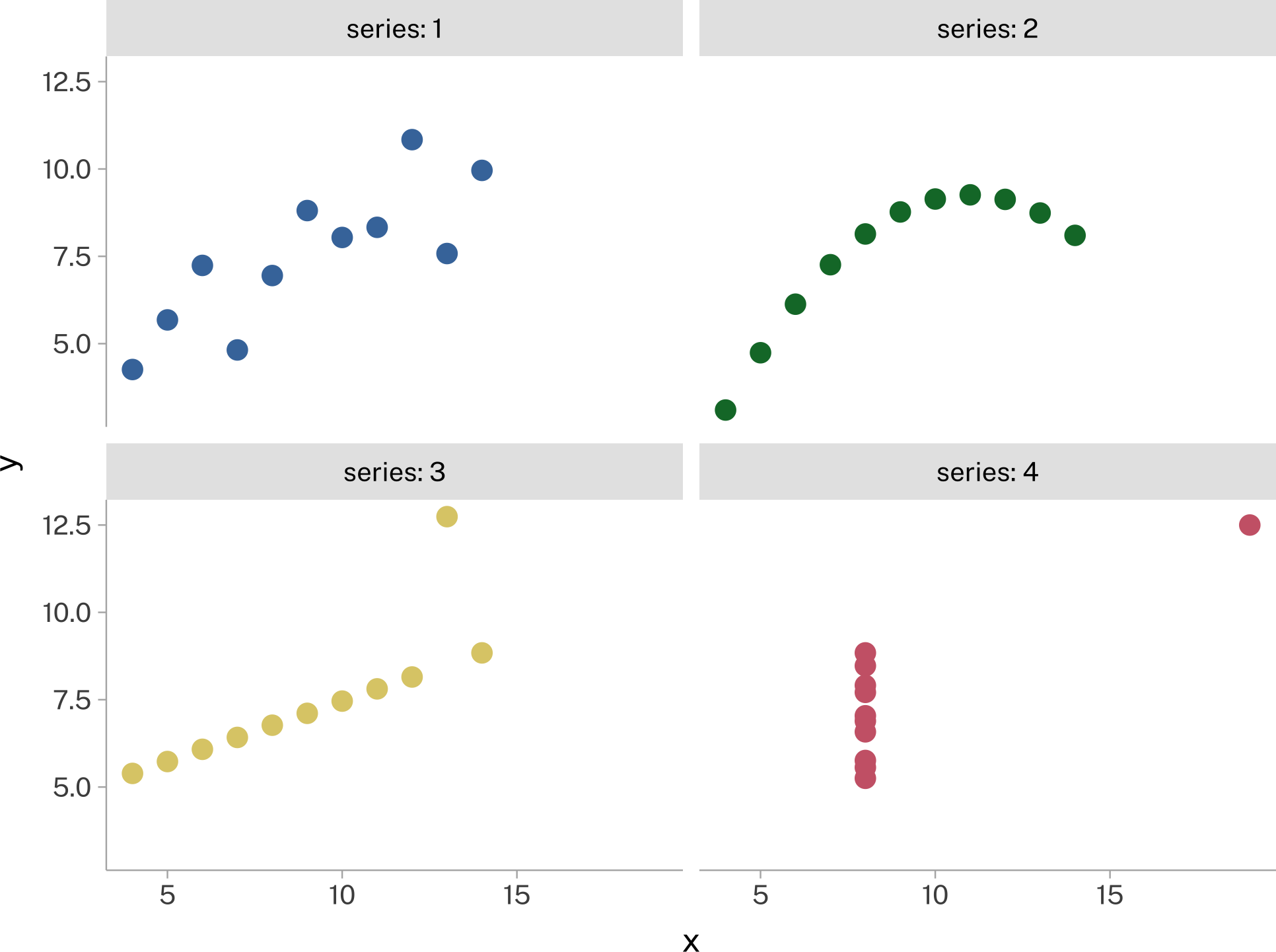
But if we decided to only look at statistical summaries of the data, or statistical models of the data, they’d look nearly identical.
| series | mean | sd | ||
|---|---|---|---|---|
| x | y | x | y | |
| 1 | 9.00 | 7.50 | 3.32 | 2.03 |
| 2 | 9.00 | 7.50 | 3.32 | 2.03 |
| 3 | 9.00 | 7.50 | 3.32 | 2.03 |
| 4 | 9.00 | 7.50 | 3.32 | 2.03 |
| series | estimate | std.error | statistic | p.value | |
|---|---|---|---|---|---|
| intercept | 1 | 3.00 | 1.12 | 2.67 | 0.03 |
| 2 | 3.00 | 1.13 | 2.67 | 0.03 | |
| 3 | 3.00 | 1.12 | 2.67 | 0.03 | |
| 4 | 3.00 | 1.12 | 2.67 | 0.03 | |
| slope | 1 | 0.50 | 0.12 | 4.24 | 0.00 |
| 2 | 0.50 | 0.12 | 4.24 | 0.00 | |
| 3 | 0.50 | 0.12 | 4.24 | 0.00 | |
| 4 | 0.50 | 0.12 | 4.24 | 0.00 |
This was taken to an extreme degree with the Datasaurus (Matejka and Fitzmaurice 2017)
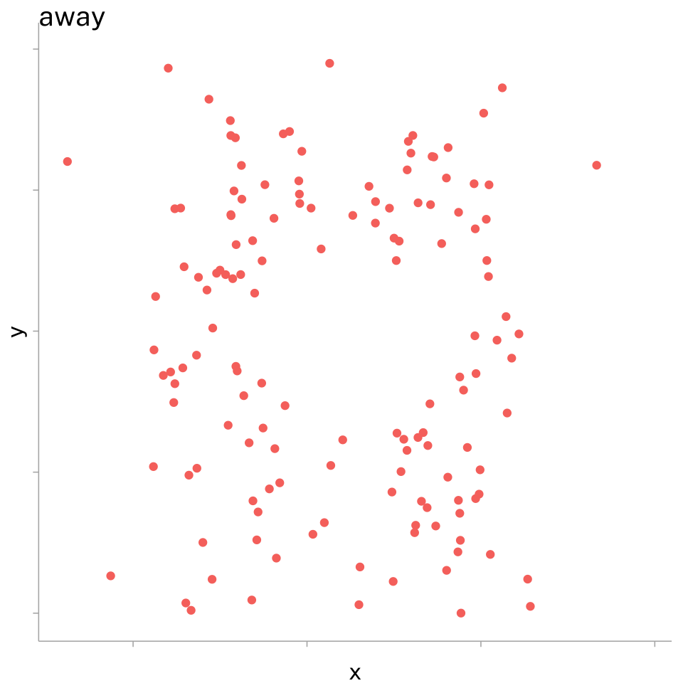
| dataset | mean | sd | ||
|---|---|---|---|---|
| x | y | x | y | |
| away | 54.27 | 47.83 | 16.77 | 26.94 |
| bullseye | 54.27 | 47.83 | 16.77 | 26.94 |
| circle | 54.27 | 47.84 | 16.76 | 26.93 |
| dino | 54.26 | 47.83 | 16.77 | 26.94 |
| dots | 54.26 | 47.84 | 16.77 | 26.93 |
| h_lines | 54.26 | 47.83 | 16.77 | 26.94 |
| high_lines | 54.27 | 47.84 | 16.77 | 26.94 |
| slant_down | 54.27 | 47.84 | 16.77 | 26.94 |
| slant_up | 54.27 | 47.83 | 16.77 | 26.94 |
| star | 54.27 | 47.84 | 16.77 | 26.93 |
| v_lines | 54.27 | 47.84 | 16.77 | 26.94 |
| wide_lines | 54.27 | 47.83 | 16.77 | 26.94 |
| x_shape | 54.26 | 47.84 | 16.77 | 26.93 |
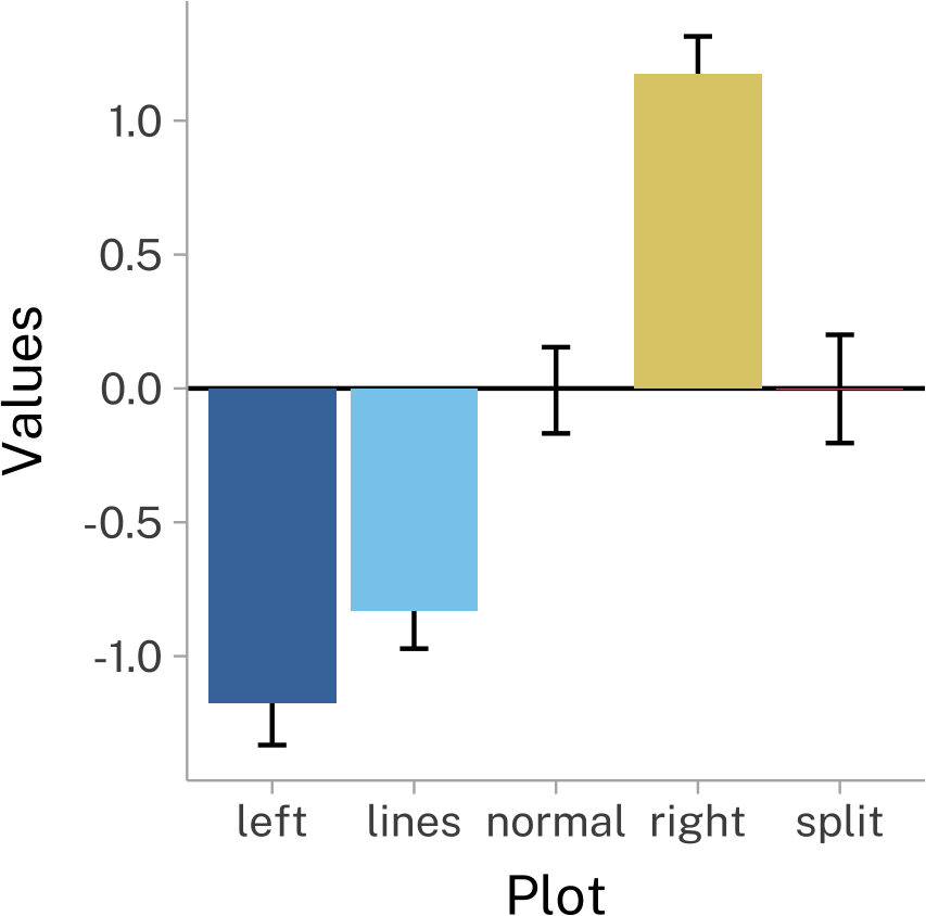
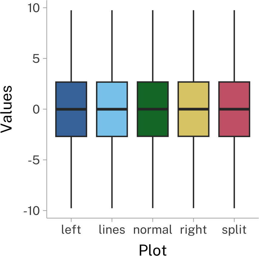
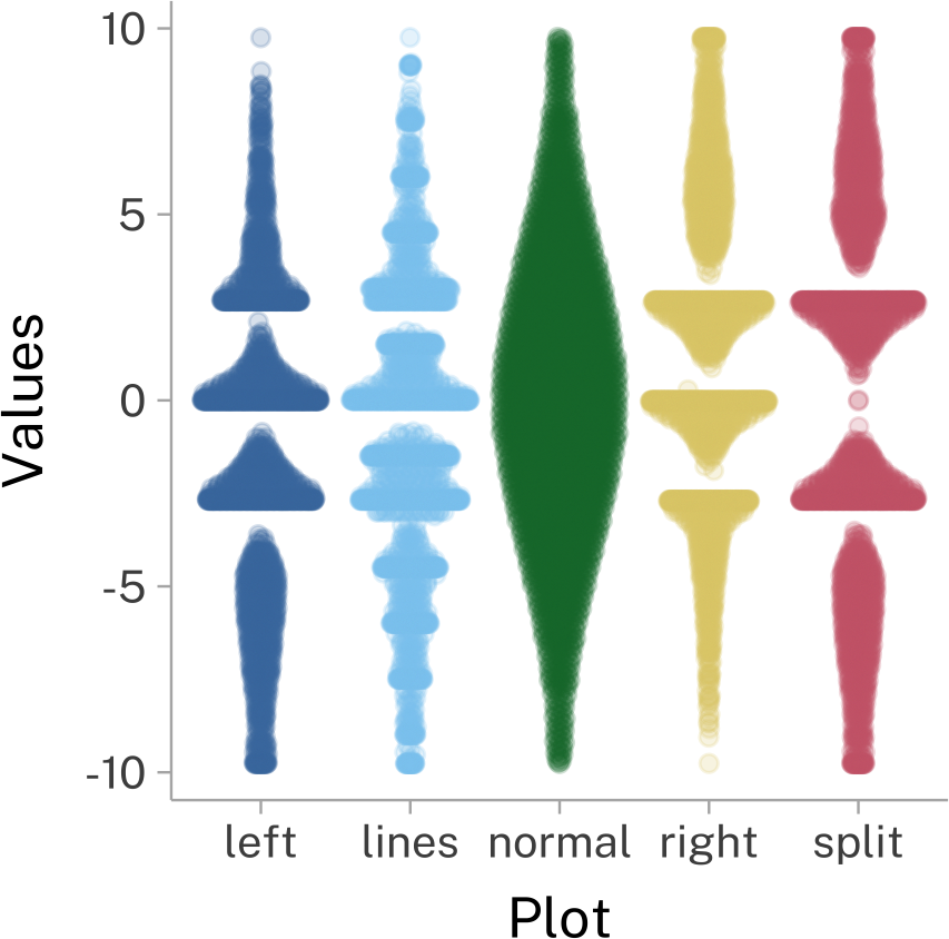
Being cautious about our plots
We also need to be careful about our plots. Here’s another set of plots from the same Matejka and Fitzmaurice (2017) paper. This time, I’ve chosen three different (and somewhat common) methods for visualizing the same dataset. Depending on the visualization method, they wind up looking really different!
References
Reuse
Citation
@online{fruehwald2024,
  author = {Fruehwald, Josef},
  title = {Why {Visualize?}},
  date = {2024-09-09},
  url = {https://lin611-2024.github.io/notes/meetings/2024-09-09_data-viz.html},
  langid = {en}
}