install.packages(
  c(
    "phonTools",
    "ngramr"
  )
)Visualization with ggplot2
visualization
ggplot2
Using ggplot2
Data Packages
library(ggplot2)
library(ngramr)
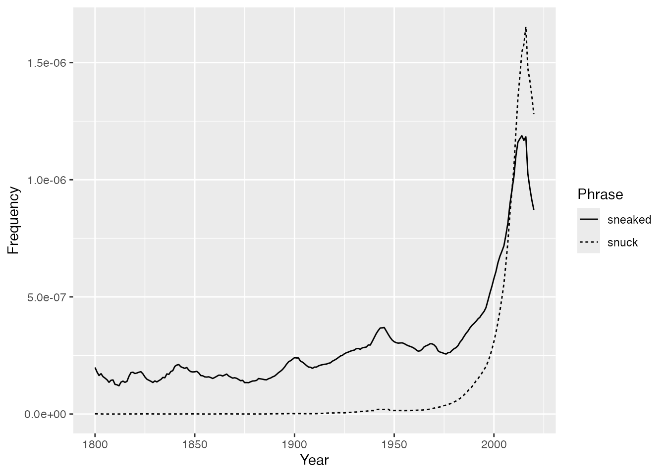
sneak_past <- ngram(
phrases = c(
"sneaked",
"snuck"
)
)rmarkdown::paged_table(
head(sneak_past)
)Anatomy of a ggplot
Data Layer
ggplot(
  data = sneak_past
)
Map data to “aesthetics”
ggplot(
data = sneak_past,
aes(
x = Year,
y = Frequency
)
)- 1
-
Think of
aes()as a special quoting function
Geometries
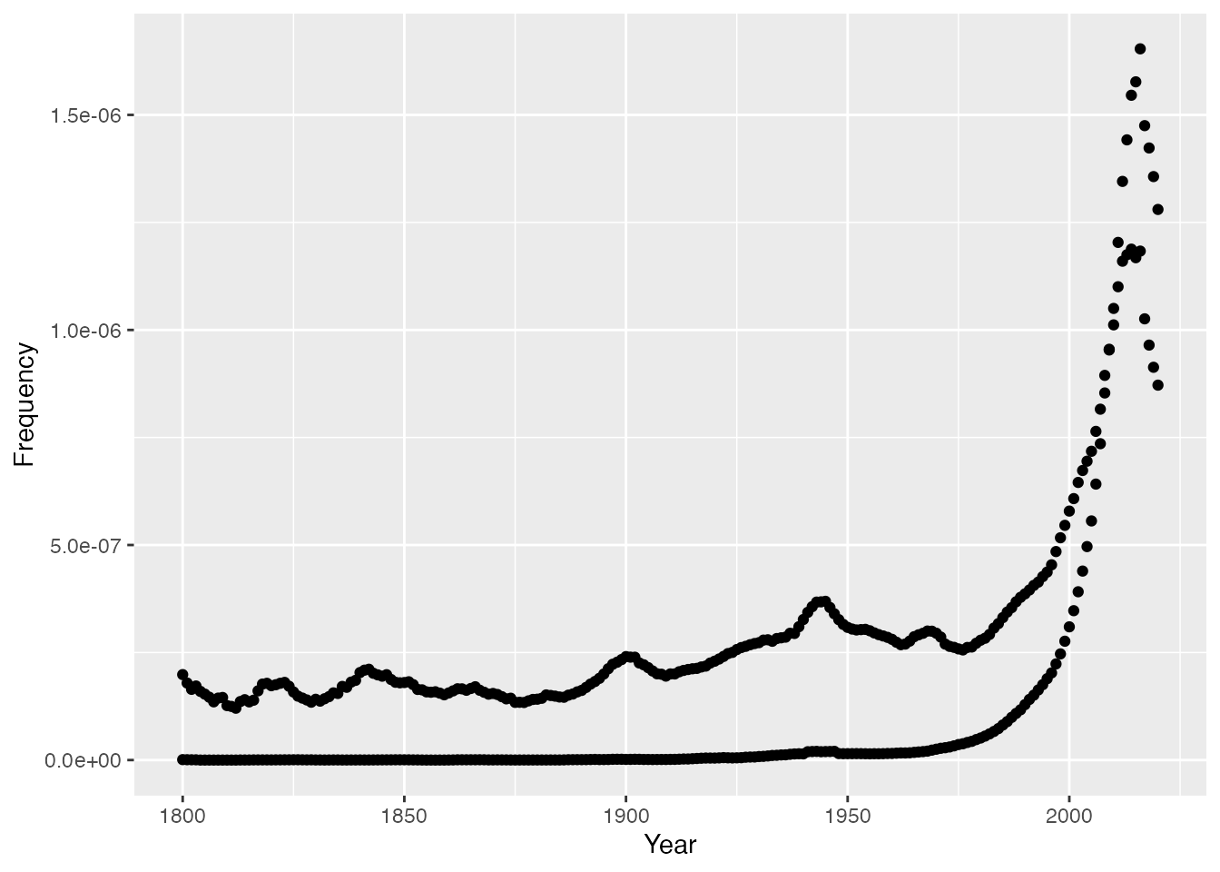
ggplot(
data = sneak_past,
aes(
x = Year,
y = Frequency
)
) +
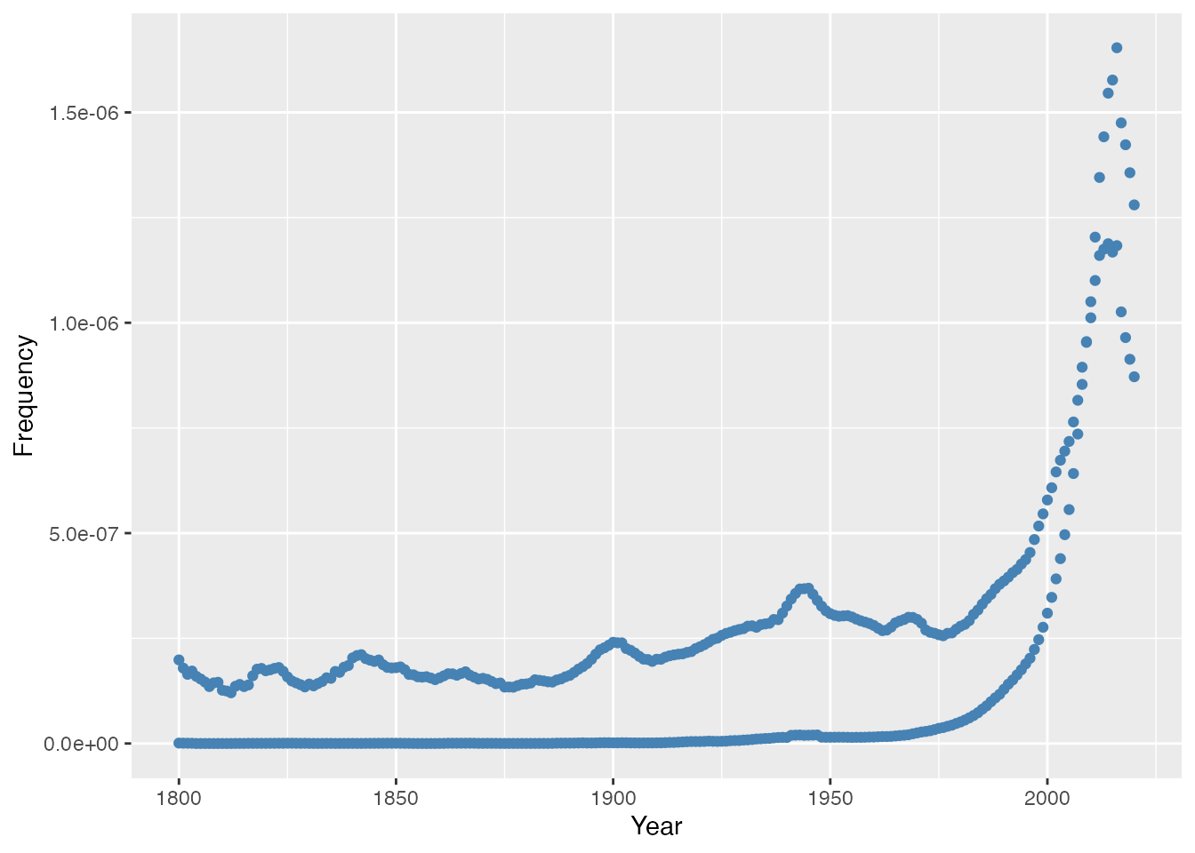
geom_point()- 1
- Points
Adjusting Geometries
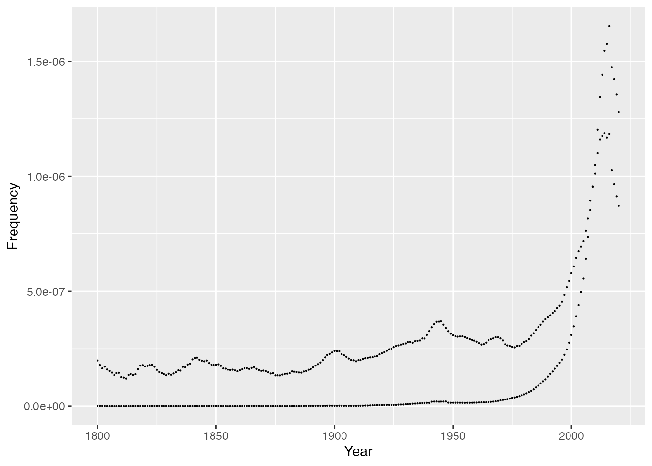
ggplot(
  data = sneak_past,
  aes(
    x = Year,
    y = Frequency
  )
) +
  geom_point(
    size = 0.1
) 
ggplot(
  data = sneak_past,
  aes(
    x = Year,
    y = Frequency
  )
) +
  geom_point(
    shape = "square"
) 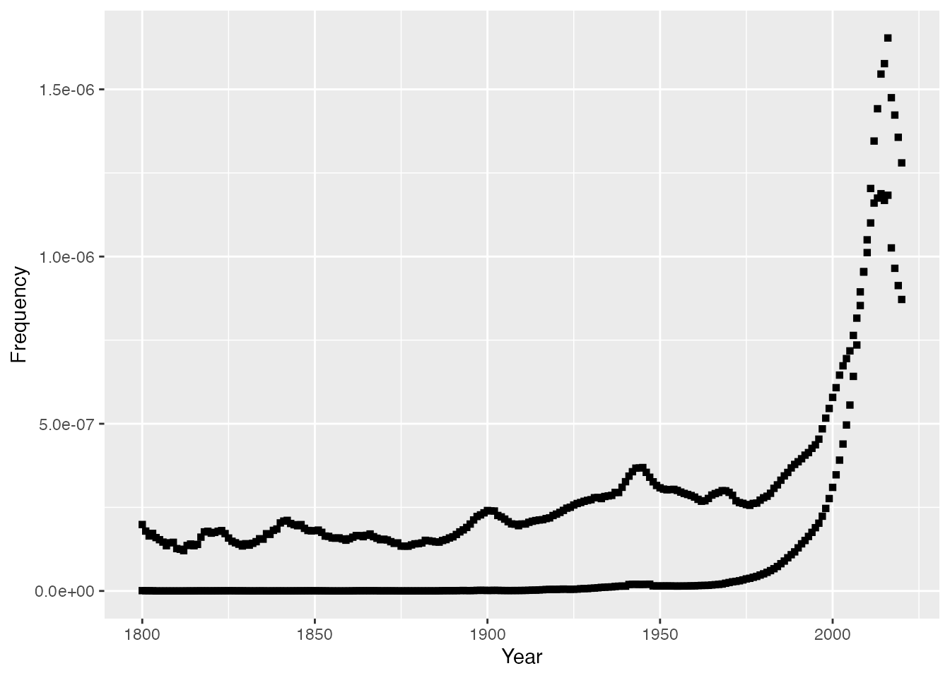
ggplot(
  data = sneak_past,
  aes(
    x = Year,
    y = Frequency
  )
) +
  geom_point(
    color = "steelblue"
) 
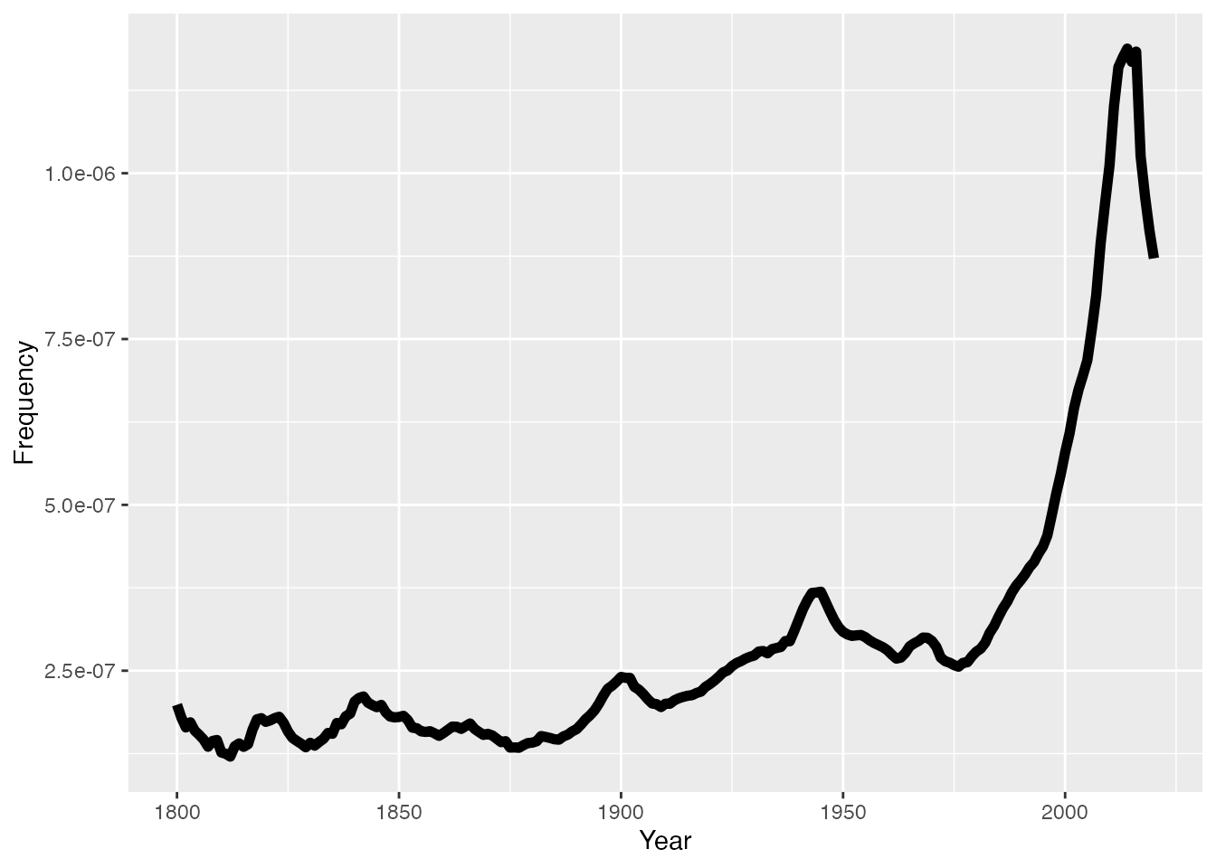
ggplot(
  data = subset(sneak_past, Phrase == "sneaked"),
  aes(
    x = Year,
    y = Frequency
  )
) +
  geom_line(
    linewidth = 2
) 
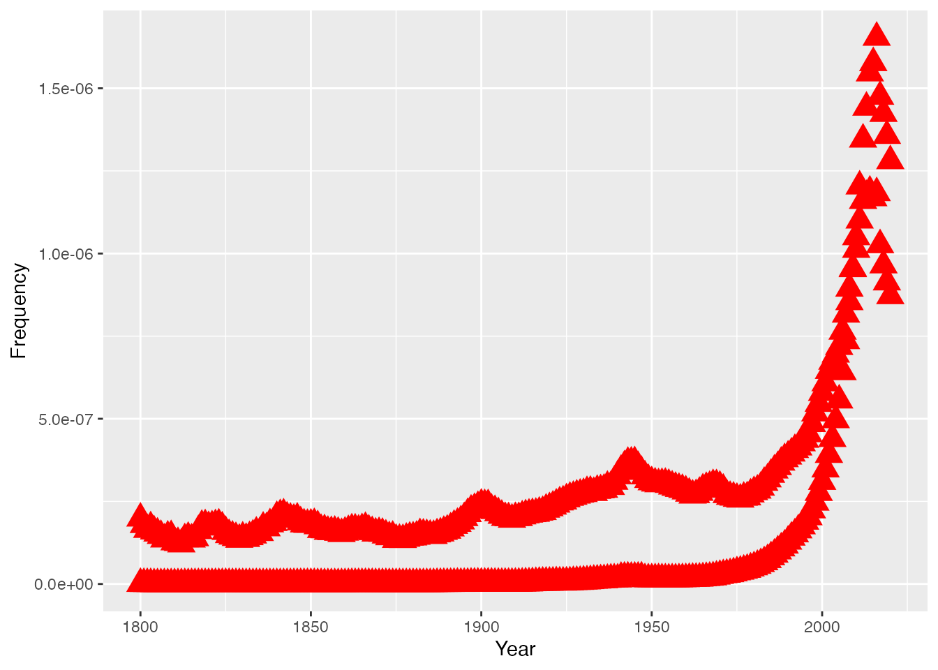
Exercise
Plot the ngram data as large red triangles
ggplot(
  data = sneak_past,
  aes(
    x = Year,
    y = Frequency
  )
)+
  geom_point(
    size = 5,
    shape = "triangle",
    color = "red"
  )
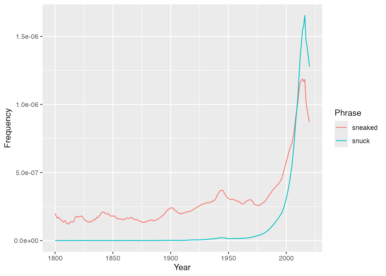
ggplot(
data = sneak_past,
aes(
x = Year,
y = Frequency
)
) +
geom_line(
aes(
color = Phrase
)
)- 1
- Mapping in geom

ggplot(
data = sneak_past,
aes(
x = Year,
y = Frequency,
color = Phrase
)
) +
geom_line()- 1
- Mapping in data layer
Exercise
We’ve been told by a journal editor that we can’t have color figures in our paper in the year 2024 CE. Instead, we need to map the Phrase data to linetype.
ggplot(
  data = sneak_past,
  aes(
    x = Year,
    y = Frequency
  )
) +
  geom_line(
    aes(linetype = Phrase)
  )
Statistical layers
library(phonTools)

data("pb52")

head(pb52) |>
rmarkdown::paged_table()ggplot(
pb52,
aes(f0, f1)
)+
geom_point()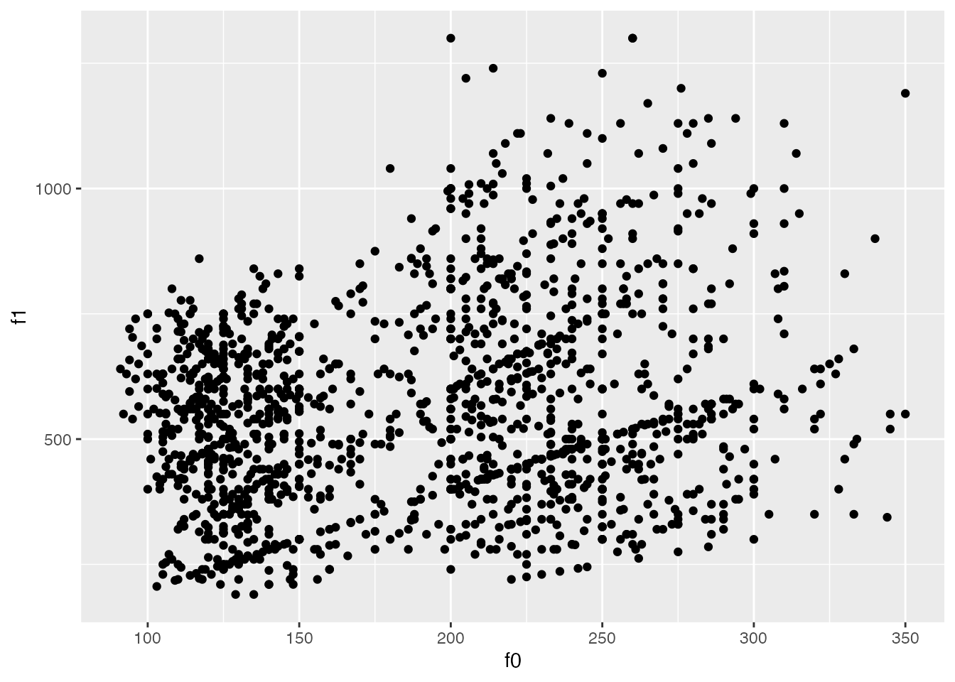
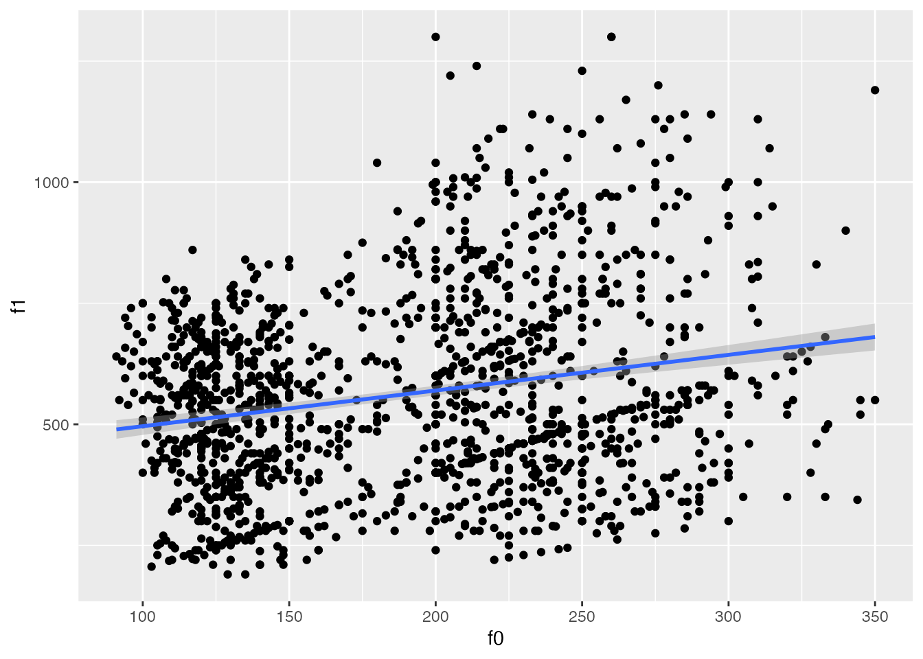
ggplot(
  pb52,
  aes(f0, f1)
)+
geom_point()+
stat_smooth(
method = lm
)
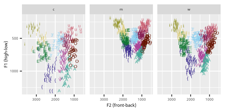
Exercise
Let’s partially recreate the Peterson & Barney plot. One addition to the code below will draw a data ellipse for each separate vowel categpory.
ggplot(
  pb52,
  aes(
    f1,
    f2,
    color = vowel
  )
)+
  geom_point()+
  stat_ellipse()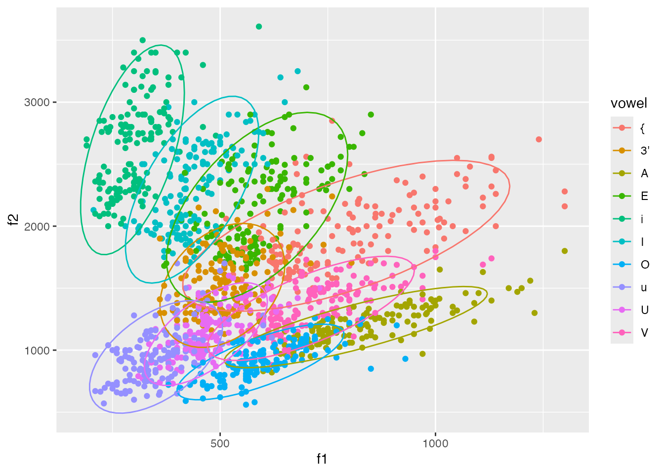
ggplot(
  pb52,
  aes(
    f1,
    f2
  )
)+
  stat_bin_2d()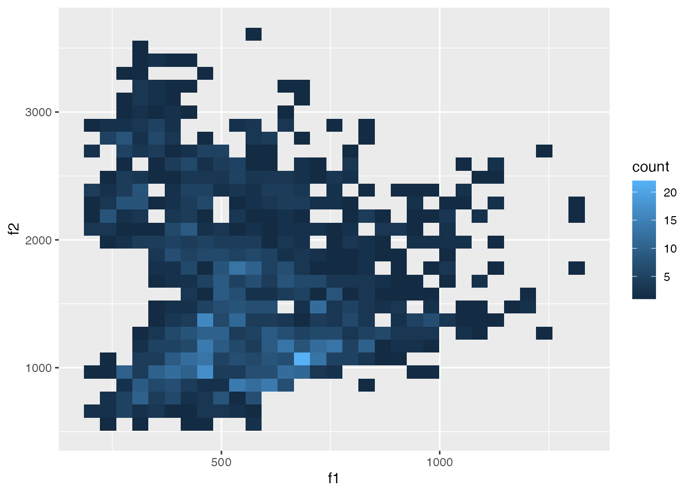
Scales
ggplot(
  pb52,
  aes(
    x = f2,
    y = f1,
    color = vowel
  )
)+
  geom_text(
    aes(label = vowel)
  )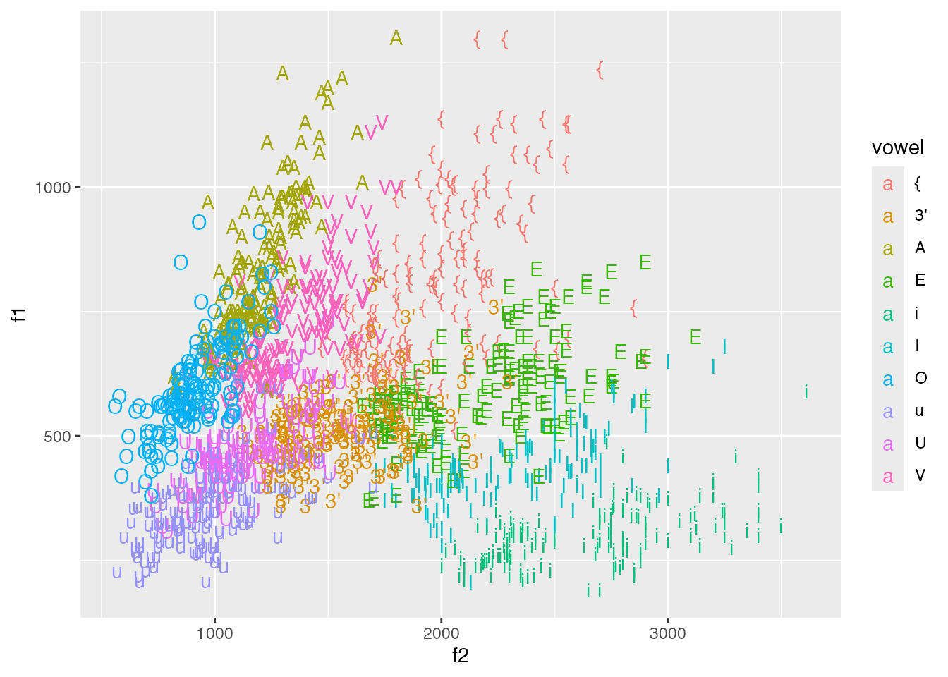
Issues
F1 and F2 dimensions are upside down and backwards.
The default color scale is problematic
library(ggthemes)

ggplot(
  pb52,
  aes(
    x = f2,
    y = f1,
    color = vowel
  )
)+
  geom_text(
    aes(label = vowel)
  )+
  scale_color_ptol()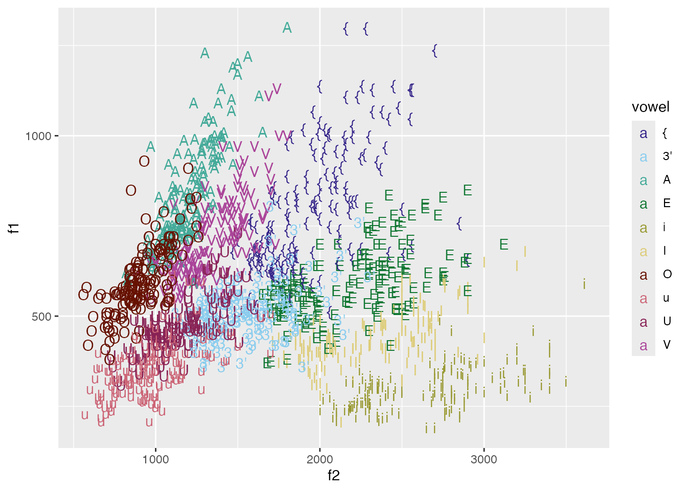
Exercise
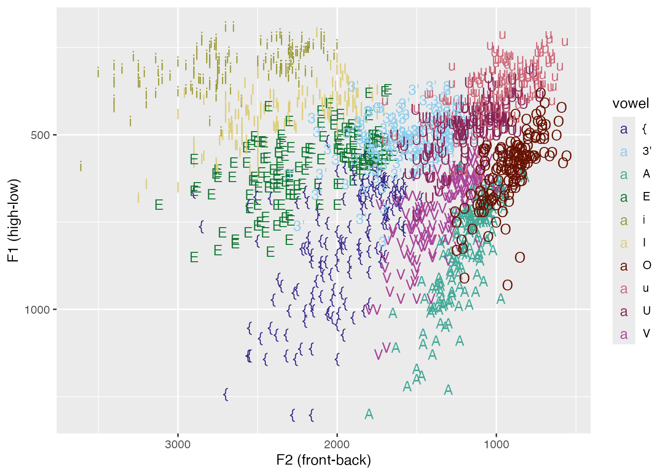
Look over the list of x/y scales to find a way to flip the x and y axes.
ggplot(
  pb52,
  aes(
    x = f2,
    y = f1,
    color = vowel
  )
)+
  geom_text(
    aes(
      label = vowel
    )
  ) +
  scale_color_ptol()+
  scale_x_reverse()+
  scale_y_reverse()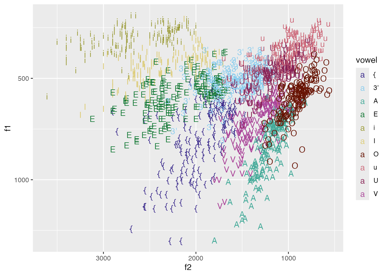
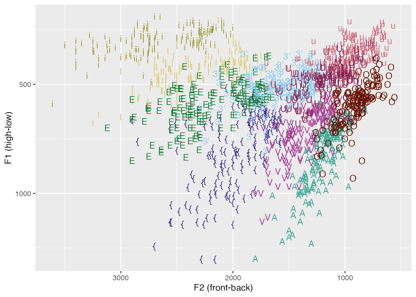
Labels and guides
ggplot(
  pb52,
  aes(
    x = f2,
    y = f1,
    color = vowel
  )
)+
  geom_text(
    aes(
      label = vowel
    )
  ) +
  scale_color_ptol()+
  scale_x_reverse()+
  scale_y_reverse()+
  labs(
    x = "F2 (front-back)",
    y = "F1 (high-low)"
  )
ggplot(
  pb52,
  aes(
    x = f2,
    y = f1,
    color = vowel
  )
)+
  geom_text(
    aes(
      label = vowel
    )
  ) +
  scale_color_ptol()+
  scale_x_reverse()+
  scale_y_reverse()+
  labs(
    x = "F2 (front-back)",
    y = "F1 (high-low)"
  ) +
  guides(
    color = "none"
  )
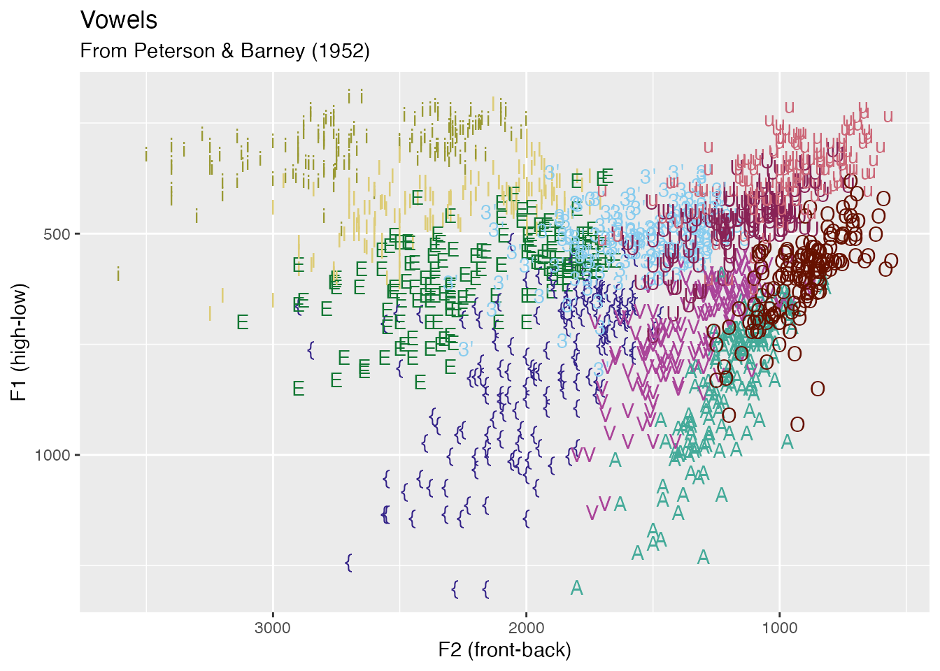
Exercise
Give the plot a title and a subtitle
ggplot(
  pb52,
  aes(
    x = f2,
    y = f1,
    color = vowel
  )
)+
  geom_text(
    aes(
      label = vowel
    )
  ) +
  scale_color_ptol()+
  scale_x_reverse()+
  scale_y_reverse()+
  labs(
    x = "F2 (front-back)",
    y = "F1 (high-low)",
    title = "Vowels",
    subtitle = "From Peterson & Barney (1952)"
  )+
  guides(
    color = "none"
  )
Faceting
ggplot(
pb52,
aes(
x = f2,
y = f1,
color = vowel
)
)+
geom_text(
aes(
label = vowel
)
) +
scale_color_ptol()+
scale_x_reverse()+
scale_y_reverse()+
labs(
x = "F2 (front-back)",
y = "F1 (high-low)"
)+
guides(
color = "none"
) +
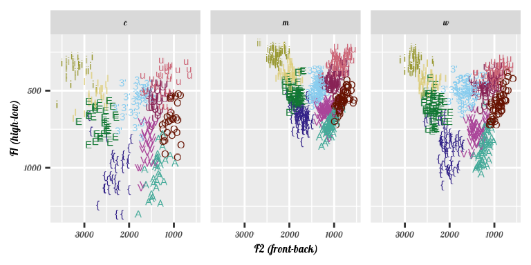
facet_wrap(~type)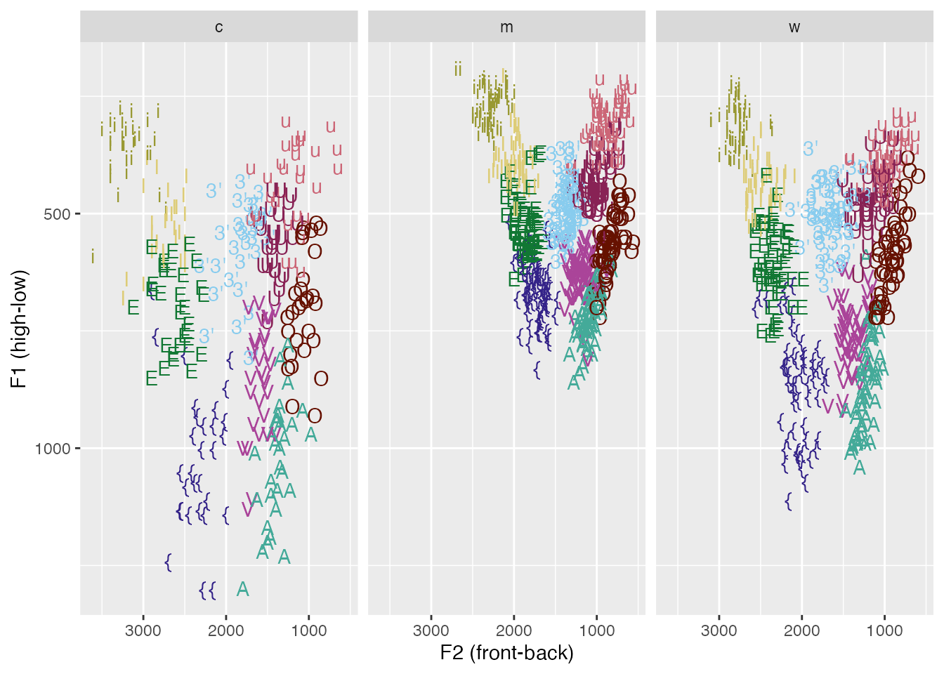
Theming
ggplot(
  pb52,
  aes(
    x = f2,
    y = f1,
    color = vowel
  )
)+
  geom_text(
    aes(
      label = vowel
    )
  ) +
  scale_color_ptol()+
  scale_x_reverse()+
  scale_y_reverse()+
  labs(
    x = "F2 (front-back)",
    y = "F1 (high-low)"
  )+
  guides(
    color = "none"
  ) +
  facet_wrap(~type)+
  theme_minimal()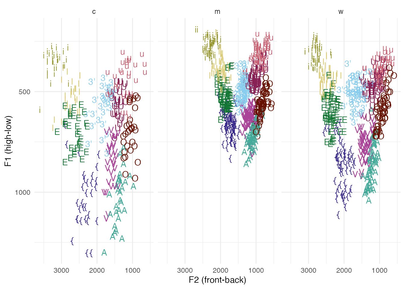
p +
  theme_bw()
p +
  theme_void()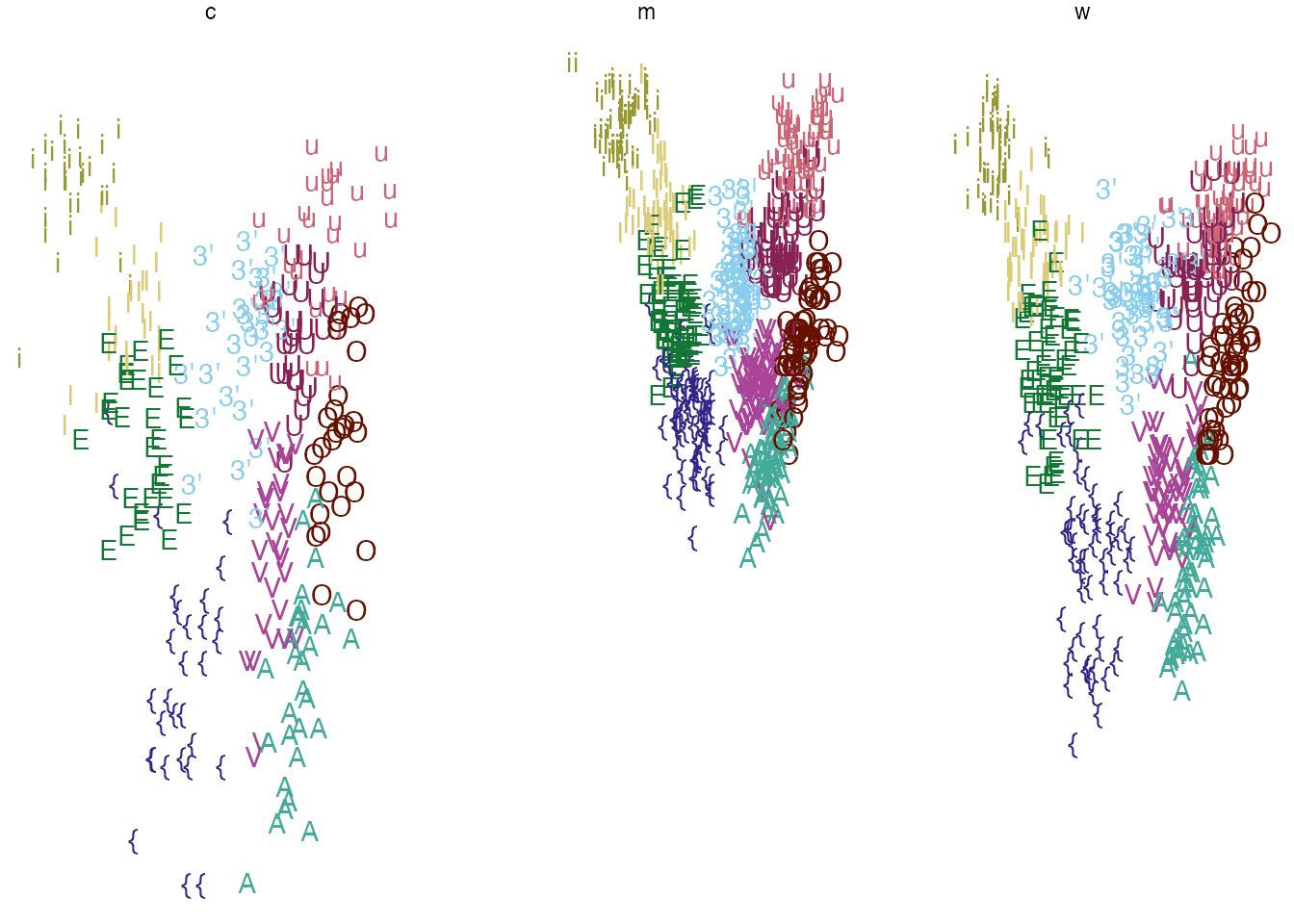
p +
  ggdist::theme_ggdist()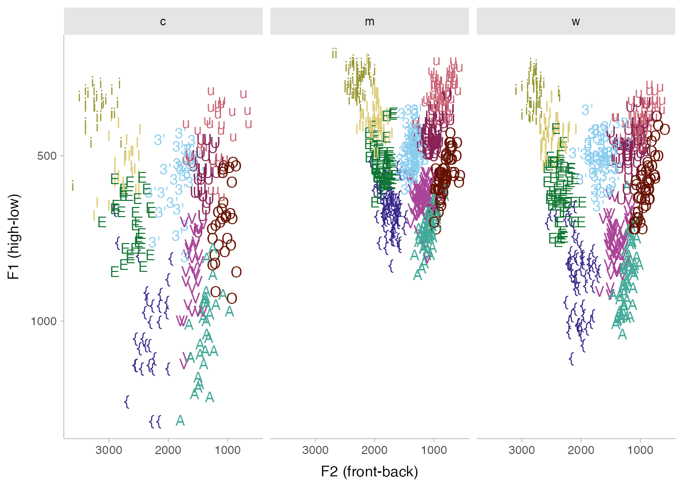
p+
  ggthemes::theme_economist()+
  ggthemes::scale_color_economist()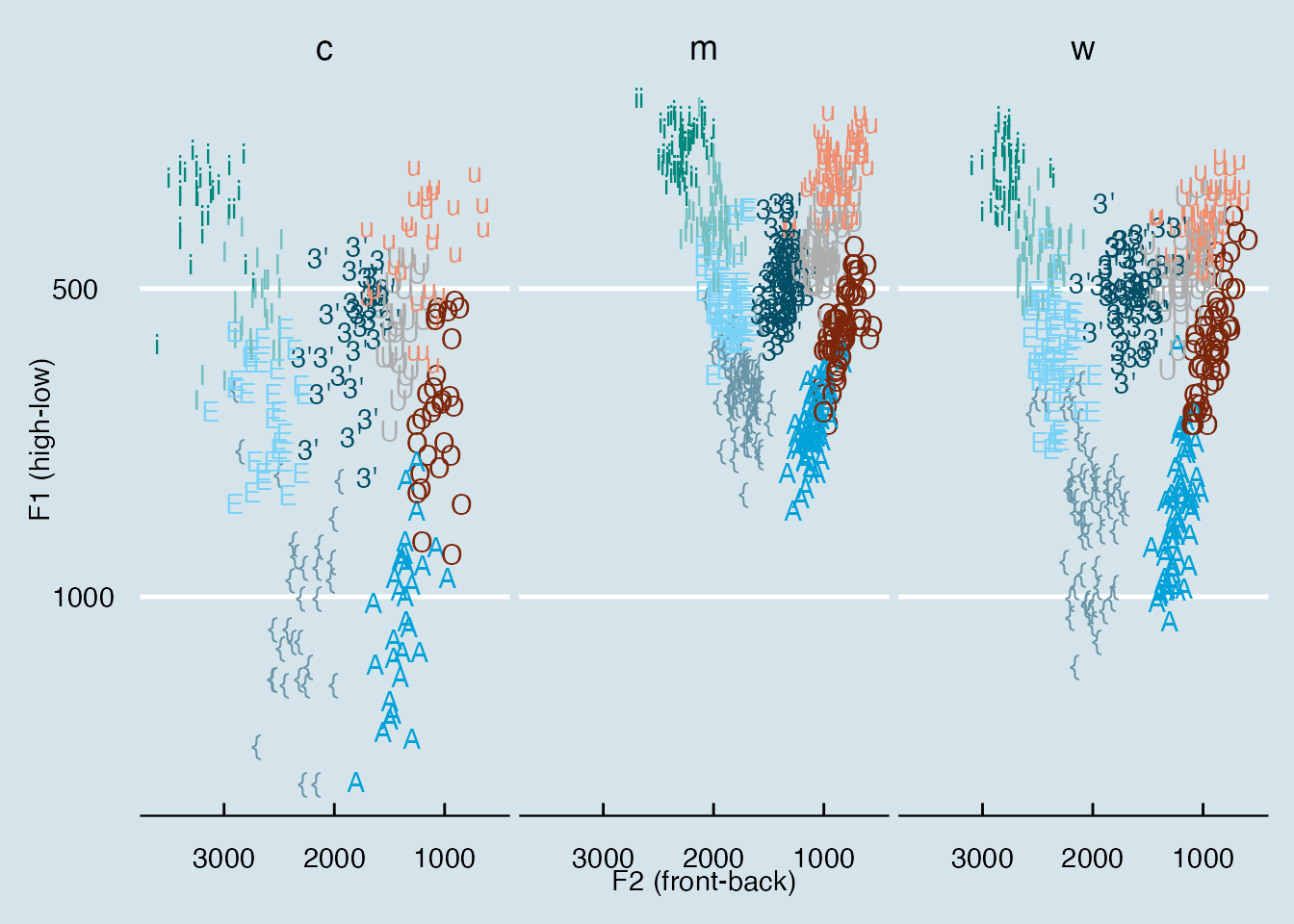
p +
  ggthemes::theme_excel()+
  ggthemes::scale_color_excel()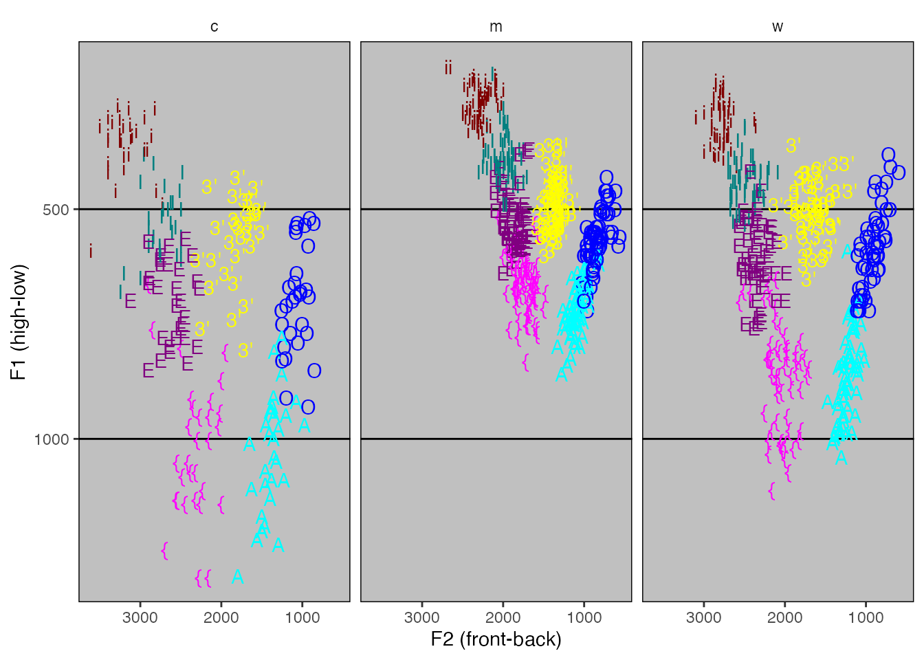
All together
ggplot(
pb52,
aes(
x = f2,
y = f1,
color = vowel
)
)+
geom_text(
aes(
label = vowel
)
) +
stat_ellipse()+
scale_color_ptol()+
scale_x_reverse()+
scale_y_reverse()+
labs(
x = "F2 (front-back)",
y = "F1 (high-low)",
title = "Vowels",
subtitle = "Peterson & Barney (1952)",
caption = "Source: {phonTools}"
)+
guides(
color = "none"
)+
facet_wrap(
~type,
labeller = "label_both"
)+
theme_minimal(
base_size = 16
)+
theme(
panel.grid.minor = element_blank(),
text = element_text(family = "Georgia")
)- 1
- The basic data layer
- 2
- A geometry layer
- 3
- A statistic layer
- 4
- Scale adjustments
- 5
- Label adjustments
- 6
- Guide adjustment
- 7
- Faceting
- 8
- A built-in theme, adjusting the base font size
- 9
- Some custom themeing (no minor breaks grid, changing the font family)
Getting fancier
You can set the plot font to any google font with the showtext package.
library(showtext)

font_add_google("Noto Sans", "Noto Sans")
font_add_google("Lobster", "Lobster")
showtext_auto()

p +
  theme(
    text = element_text(family = "Noto Sans")
  )
p +
  theme(
    text = element_text(family = "Lobster")
  )
Reuse
CC-BY 4.0
Citation
BibTeX citation:
@online{fruehwald2024,
  author = {Fruehwald, Josef},
  title = {Visualization with Ggplot2},
  date = {2024-09-09},
  url = {https://lin611-2024.github.io/notes/meetings/2024-09-09_ggplot2.html},
  langid = {en}
}
For attribution, please cite this work as:
Fruehwald, Josef. 2024. “Visualization with Ggplot2.”
September 9, 2024. https://lin611-2024.github.io/notes/meetings/2024-09-09_ggplot2.html.